
Just starting out with watercolor? Here are 35 actionable steps that you can take to fix those common watercolor mistakes that everyone makes and dramatically improve your paintings.
- How To Avoid Watercolor Mistakes
- 1: Using Too Much Water
- 2: Buying The Most Expensive Art Materials
- 3: Unnatural Looking Clouds
- 4: Back Runs, or "Cauliflowers"
- 5: Unwanted Splatters
- 6: Painting An Area Too Light, Or Too Bright
- 7: Using Cheap Watercolor Paper
- 8: Not Using Enough Water
- 9: Not Changing Your Water Regularly
- 10: Not Doing A Test Painting First
- 11: Using Brushes That Are Too Small
- 12: Using The Color Black
- 13: Colors Too Pale & Washed Out
- 14: Muddy Colors
- 15: The Horizon line Is Slanting Or Wobbly
- 16: Not Allowing Enough Drying Time
- 17: Painting Too Many Layers
- 18. Using Pre-Mixed Greens
- 19. Painting On A Horizontal Surface
- 20. Trying To Exactly Reproduce The Colors In A Photo
- 21: Using Too Many Colors
- 22: Lack Of Preparation
- 23: Trying To Blend With A Brush
- 24: Lack of Contrast
- 25: Not Doing A Tonal Sketch
- 26: Overworking Your Painting
- 27: Trying Too Hard To Fix Mistakes
- 28: Not Separating The Planes
- 29: Boring Flat Washes
- 30: Not Controlling Wet into Wet Areas
- 31: Painting Too Slowly
- 32: Forgetting To Leave White Space
- 33: Being Too Scared To Make Mistakes
- 34: Colors Are Bleeding Into Each Other
- 35: Giving Up Too Soon
- Recommended Reading
As an illustrator, I’d been working for years almost exclusively in the medium of digital paint. Photoshop, Illustrator etc. I really got used to the convenience that software offers. I literally had control over every aspect of my work. By contrast, watercolor painting is more like a high wire act. There’s no “Undo” safety net to save you when you slip up. So what can be done to fix mistakes in your watercolor painting when you make them?
Watercolor painting mistakes tend to fall into one of two categories. Things that make you go “Duh!” and things that make you go “Oops!” Let me clarify. Design mistakes are the kind of mistakes that you don’t recognize until it’s too late. They were hard wired in to your work from the start. These are mistakes that could and should have been avoided. Bad composition, bad color choices, incorrect tonal values, bad drawing. In other words. Things that make you go “Duh! Why didn’t I see that sooner?
Then there are what I call Execution Mistakes. Execution mistakes are usually made in real time. They usually result from a misjudgment or a miscalculation with the medium itself e.g using too much water, too little water, not leaving enough drying time etc. In other words. Things that make you go “Oops! I really didn’t mean to do that.”
If you need some help trying to select appropriate art supplies for your needs I’ve put together a list of my recommended art supplies.
How To Avoid Watercolor Mistakes
You know what they say, “An ounce of prevention…. etc etc” The good news is, you can eliminate 80% – 90% of all your “Duh!” mistakes before you even start, by following this three step routine.
- Preparatory sketches. These help you to get all your ducks in a row, so to speak. Try some different compositional ideas. Work out where you want the focus of of your picture to be.
- Tonal studies. These can be done with a pencil, felt tips or by painting with a neutral tint. Most successful paintings have a clear foreground, midground and background. Use separation of tone to clearly define these.
- Color studies. This just ensures that the colors you are planning to use actually work well together. It’s also like a dry run for the actual painting. I do my color studies at about the size of a business or credit card.
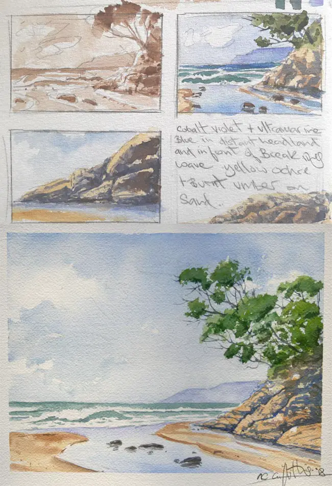
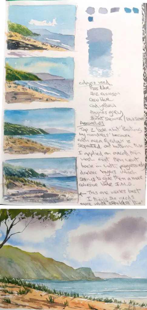
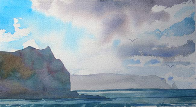
In the example of the seascape painting above, I started with a simple pencil sketch of the basic composition. I knew that I wanted to lead the viewer’s eye into the picture with that channel of water flowing into the sea. I painted sepia tones over the top of my pencils to see how the tones would balance out. You can see that I was also solving the problem of what brush techniques would best indicate the rocky textures while at the same time thinking about warm and cold complementary color contrasts. I even made some written notes about the colors I’d used. In actuality, The final painting (Shown at the bottom) was about six times larger than the tiny color studies above it and to be honest, I prefer the tiny studies to the final painting but that’s often the case!
Every artist is familiar with the terror of the white page. Painting when the stakes are low always produces the freer livelier work. The point is that when I came to do the final painting I knew pretty much exactly how I was going to approach it and that ultimately saved me lot of time and effort and reduced the fear factor. That fear of making a mark is basically the fear of failure. Following this three step routine gives me a confidence I need to overcome this psychological barrier. I believe that this confidence shows through in my brush strokes when I come to execute the final painting.
Confidence will lend your paintings an irresistible appeal and helps to minimise the “Oops!” mistakes that can often result from excessive timidity.
It can be difficult to make yourself follow a routine like this when you are caught up in the fire of inspiration. You just want to get on with it. But I promise that if you do, you will save yourself a lot of needless frustration in the long run. I’ve found that I’ve progressed with the medium so much faster.
Having said that. I still make mistakes. Plenty of them. Some mistakes can be corrected and some can’t. It helps to know which kind of mistake is which. The first question I ask myself is, does this mistake even need to be fixed? A backrun that forms in the sky could just as easily be an intentional rendering of a natural cloud formation. That hill that softly bleeding into the sky is just aerial perspective. Who’s to know for sure except me? These are prime example of those happy accidents that I mentioned before.

So let’s go through some of those mistakes that you will likely make and what, if anything can be done about them?
Acting quickly is usually the key. You need to recognise the problem and fix it as it is occurring, for the best chance of success.

1: Using Too Much Water
The Mistake: Too much water means that your colors will tend to be pale and washed out. You may have to paint over the the area twice, dulling your initial wash and losing that appealing freshness. Too much water can also lead to drips and “Cockling” (When the paper buckles and ripples) this generally makes the paint difficult to control.
How To Fix: You can avoid this problem by being aware of how much water is on the brush and how much water is already on the paper. You can dab excess water from the brush by dabbing it on a piece of clean cloth or paper towel. You may even need to gently squeeze the water out between your fingers first. Wet Into Wet is a commonly used technique. but it can easily get out of control.
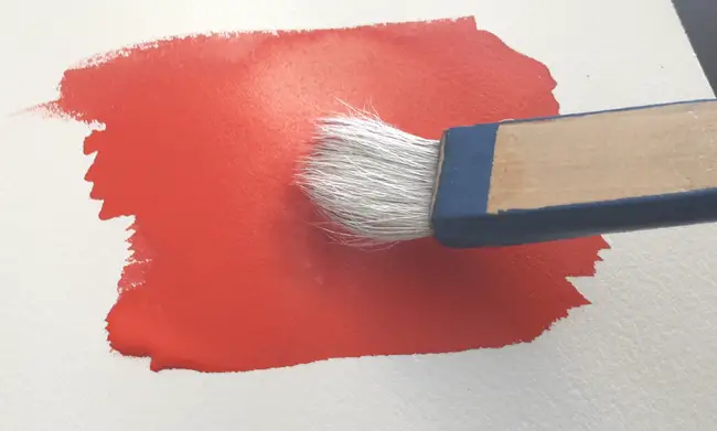
2: Buying The Most Expensive Art Materials
It’s easy to get carried away and overspend on watercolor painting supplies. You don’t need to have $150 Kolinsky Sable brushes, the finest Schminke paints porcelain palettes and a myriad of other things. If I added up the cost of my three favorite brushes, it would come to less than $20.
The important thing is knowing where to allocate your resources in order to get the most bang for your buck. Dollar store palettes are often identical to the ones on sale for 5 times as much in high priced art shops. Student grade paints will serve you perfectly well. I use a mixture of student grade Cotman paints with higher priced professional quality paints for a few specific favorite colors.
Paper is one area where I do go for best quality as it is the one supply that makes the biggest perceivable difference to the end result.
3: Unnatural Looking Clouds
The Mistake: When painting dark clouds wet on dry over a pale blue sky the edges look unnaturally hard and distinct.
How To Fix: If the paint is still wet, you can just lightly spray the edges with water from a misting spray bottle. This will soften the edges beautifully.
If the paint has dried you can re wet the edges and gently brush them out.. Either with a paintbrush or with a cotton bud.
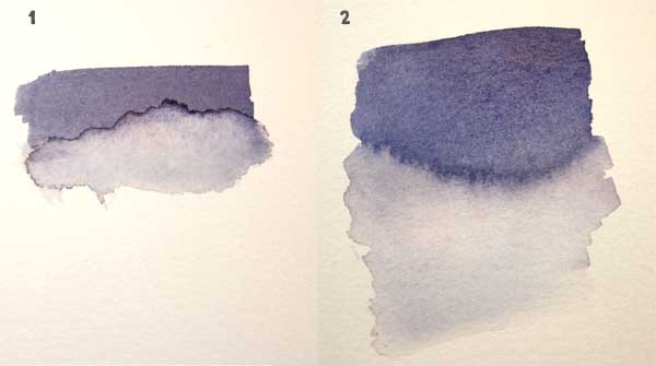
4: Back Runs, or “Cauliflowers”
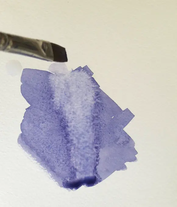
The Mistake: Back runs occur When you lay a wash down on paper and then when you add more a bloom effect occurs as in the above pic. This happens because the paint on the paper has dried slightly and is now denser than the paint hat you’ve just added from your brush.
How To Fix: Take a large dry (Thirsty) brush and brush into the forming cauliflower. The brush will suck up the excess water and stop the back run dead in it’s tracks. Continue to do this and wipe the excess liquid off the brush onto a clean cloth or paper towel repeating the process until you are out of the danger zone.
5: Unwanted Splatters
The Mistake: You sneezed while you were about to stroke in a delicate tree branch and now it looks like you just swatted a fly on the paper.
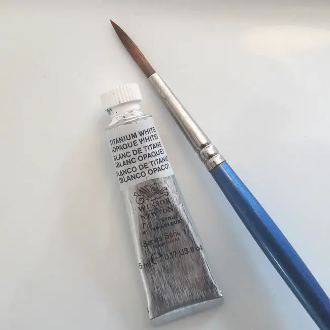
How To Fix: Very quickly, place a sheet of paper towel down on your painting and firmly press down. If the spatters were only thin watery paint you can soak them right up. Remember, watercolor paint always dries lighter, so those spatters should also fade back and be even less noticeable when completely dry.
If the splatters are too dark to absorb, mix an opaque version of the color you need to do the cover up by mixing in Titanium White or White Gouache. This will require some careful color matching and can only really be done on small areas or it will become noticeable. Titanium White is the most opaque of watercolor whites and covers well. You could use Chinese White but be aware that Chinese white has a greater transparency than Titanium White and has a somewhat bluish tint.
Amazon stocks Winsor & Newton’s Titanium White, Daniel Smith’s excellent version and also Winsor & Newton’s Gouache, Permanent White. I highly recommend any of these.
6: Painting An Area Too Light, Or Too Bright
The Mistake: This isn’t a major problem. You could argue that it’s not even a mistake. Simply wait for it to dry and paint another wash over the top. Be aware though that some watercolors are more opaque than others and painting opaque over opaque tends to create muddy colors.
How To Fix: Manufacturers often supply color information about their paints which indicates whether a color is opaque or transparent or semi-transparent. The easiest way is to test it out for yourself, by painting over a dark color with a lighter one. If the lighter one appears to be sitting on top of the darker one, it’s opaque.
To tone down the brightness of a color, paint a very thin glaze of it’s complementary color over the top.
7: Using Cheap Watercolor Paper
Art supplies are expensive but paper is one area that I would suggest you don’t compromise on if you want to produce a good watercolor painting. I spent 6 months using cheap watercolor papers. In that time, I only managed to produce one painting that I liked. I was about to give up on watercolors altogether when I decided to give it one last go with some good quality Winsor & Newton paper, then I went all the way and invested in some Arches 100% cotton paper. Seemingly miraculously, after a short adjustment period, the quality of my work improved dramatically.
The Mistake: Cheap papers are made from cellulose i.e. wood pulp. In my experience, painting on cellulose paper is a struggle from start to finish. Cellulose watercolor papers absorb water very slowly, this, in turn, tends to make unwanted backruns or cauliflowers a common occurrence. Wet into wet washes, look rather dull and lifeless as opposed to the vibrant bloom and blend that happens on cotton paper. Washes tend to streak more and the colors generally lack luminosity when dry. All in all, the act of painting becomes a tedious struggle instead of a lively dance.
How To Fix: Use 100% cotton watercolor paper. It’s understandable that you won’t want to waste tons of expensive paper when you are just starting out. So here’s my suggestion. “Rehearse” your paintings first on a cellulose paper paper then try painting the same thing on a 100% cotton paper. Or, if you’re a complete beginner, you could set yourself a time limit. Put yourself in cellulose paper boot camp (4 – 8 weeks maximum) then you can get the psychological boost of seeing your work improve in leaps and bounds when you make the switch to 100% cotton.
I’m not saying that expensive watercolor paper will transform you from a bad artist into a good one. But you have to avoid setting yourself up for failure.
For best quality, I highly recommend Arches 100% cotton watercolor paper 140 lb cold press
Buy Arches watercolor paper from Amazon
For a good quality inexpensive cellulose paper I recommend Reeves watercolor pads.
Buy Reeves Watercolor Pads from Amazon
8: Not Using Enough Water
The Mistake: You didn’t use enough water and now you have to mix more paint to complete your wash. It’s very difficult to match up two consecutive batches of paint to an equal strength and consistency and The first wash will probably have dried before you have time to mix up another. This will usually result in patchy coverage and streaks in your washes.
How To Fix: Good quality watercolor paint is highly pigmented and a small amount can cover a large area. So you need to make sure you’re adding the right amount of water to get maximum coverage. In general, this is about one part paint to about 4 parts water.
Related Posts: How to paint a perfect flat wash in watercolor. How To Mix Watercolors The Best Way
9: Not Changing Your Water Regularly
The Mistake: Dirty water will quickly discolor and contaminate your artwork causing incorrrect and muddy colors.
How To Fix: One solution would be to have two jars of water at all times. One for washing out the brush between colors and the other for actually mixing in to the paint. I don’t do this myself because I tend to forget which one is which. I prefer to use one large jar of water for washing out my brush and a spray bottle for adding water to paint. This way you minimize the likelihood of contaminating the paint mix as much as possible. Changing the water every ten minutes may interrupt your workflow so use a larger jar of water to reduce the frequency that you need to change it.
10: Not Doing A Test Painting First
The Mistake: You got excited about creating a new piece of work but you encountered a snag you didn’t anticipate and now the painting is ruined and worse, you wasted expensive paper.
How To Fix: A musician wouldn’t dream of playing a piece of music in front of an audience without rehearsing first so try rehearsing your paintings too. i.e. practice several times at business card size. Before doing the real thing. It should only take you a few minutes. Watercolor is a fast medium remember. Rehearsing your paintings at a smaller size allows you to make your mistakes without consequences.
11: Using Brushes That Are Too Small
The Mistake: Using a brush that is too small will make it impossible to cover a significant area of paper evenly. It’s basically the same issue as using too little water.
How To Fix: Use a brush that’s appropriate to the size of the area that need to be painted. For example. If you’re painting a large area such as a sky, I would recommend a 1/5″ – 1″ Flat Brush or Hake Brush. If you are working on sheets of paper larger than 36″ X 51″ you probably need to go for even larger brush sizes.
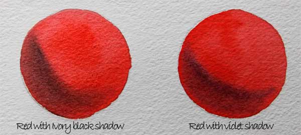
12: Using The Color Black
The Mistake: There are two potential problems. 1.You tried to darken a color by adding black and the color either became very dull or changed color completely. e.g adding black to yellow turns it green. 2. You painted something that looks black in real life with black paint but it just looks wrong.
How To Fix: Instead of black, Use a variegated wash of cool dark colored neutrals. Very few things in the natural world are actually black. Even black man-made items are not really perceived as black. I’m looking at my black computer keyboard right now. The edge facing me is darker than the keys and there are also a range of other hues and reflections resulting from the interaction with light. Remember, black isn’t actually a color. It can be described more accurately as an absence of light. For this reason, using pure black in a painting tends to stick out like a sore thumb.
To darken a color, try mixing it with a darker analogous color. For example, You could mix red with a dark violet. This will allow it retain vibrancy. You could also pick a dark green from the opposite side of the color wheel i.e a dark green. This will mute the color to a degree making it more of a colored grey. Taking this approach will allow you to create colored neutral tones that harmonize well and don’t look out of place.
13: Colors Too Pale & Washed Out
The Mistake: You painted a wash that seemed to be the right color and tone but when it dried it looked pale and dull.
How To Fix: Remember that watercolors tend to dry about 25% lighter than when they are wet. It’s better to err on the side of applying a color too strongly rather than too weakly and ending up with limp washed out paintings.
14: Muddy Colors
The Mistake: You add more and more colors to get just the right mix but your paint ended up looking dull and muddy.
How To Fix: Limit yourself to a maximum of three colors for any mix. Limiting yourself in this way will help to ensure that your colors stay bright and vibrant. More than three and you’re heading into the dreaded “Mud” territory.
Related Posts:
How To Mix Colors The Right Way
How To Mix Perfect Greens
15: The Horizon line Is Slanting Or Wobbly
The Mistake: Your brush slipped and your horizon line looks wonky.
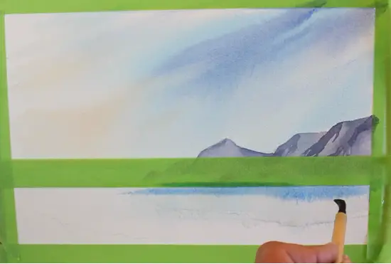
How To Fix: It shouldn’t need to be stated that horizon lines should always be horizontal! To ensure that your horizon line doesn’t wander, mask it off with a strip of low-tack masking tape, Then you can just paint up to the line and remove the tape when the paint is dry.
16: Not Allowing Enough Drying Time
The Mistake: You paint a nice crisp mountain range and it bleeds into your still damp sky.
How To Fix: In watercolor painting, there are three distinct stages a painting goes through before it actually dries and becomes safely inert. Wet, moist and damp. Some artists have identified up to eight stages, but for the sake of simplicity, let’s stick to three.
Be patient and ensure that your paint is completely dry before adding another layer of wet paint on top. This way, it will keep a crisp hard edge. When a painting is wet or moist, the paint can still be manipulated. That is, it can be blended or extended by adding more paint. Though you do need to be careful that you don’t add paint that is wetter than is currently on the page or back runs will still occur.
The damp stage is the one where you have to be the most careful, as it can appear to be dry. Check that it is dry by gently resting your palm on the surface. If it feels cool, then it is still damp and needs longer. You can of course speed up the drying process with a hairdryer but I tend not to do this as it also lightens the colors more than they would through the natural drying process.
Related Post: How To Paint Soft & Hard Edges in Watercolor
17: Painting Too Many Layers
The Mistake: Your painted several layers of glazes which caused you painting to look dark and dull.
How To Fix: Watercolor is a transparent medium and laying one color over another color, a technique known as “Glazing” can when handled well, create luminous color combinations. Not all watercolor paint is equally transparent though and over use of glazing can easily lead to dark, dull paintings. Watercolor tubes have transparency ratings that tell how transparent or opaque a color is.
Handprint.com has a comprehensive explanation of watercolor pigments and their transparency ratings. Which can be seen here.
18. Using Pre-Mixed Greens
The Mistake: You bought several tubes of green to paint landscapes with but they all look strange and unnatural. The worst offenders have an acidic almost neon quality to them which is totally unsuitable for representing the greens of nature.
How To Fix: You can mix very natural looking shades of green simply by experimenting with mixing Ultramarine, New Gamboge and Cadmium Yellow for Pale green to Mid green. Try adding Payne’s grey and Prussian Blue for Mid to Dark greens.
Related Post: How To Mix Perfect Greens
19. Painting On A Horizontal Surface
The Mistake: Painting on a flat surface makes it impossible to control the flow of the paint
How To Fix: You don’t necessarily need to buy an expensive easel but It’s much easier to control your painting if you know which way the paint is going to flow. Rest your paper on a surface that is angled somewhere in the region of 15 to 30 degrees. You can always pick it up and tilt in a different direction if you need to stop it, or redirect it.
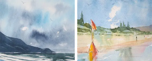
20. Trying To Exactly Reproduce The Colors In A Photo
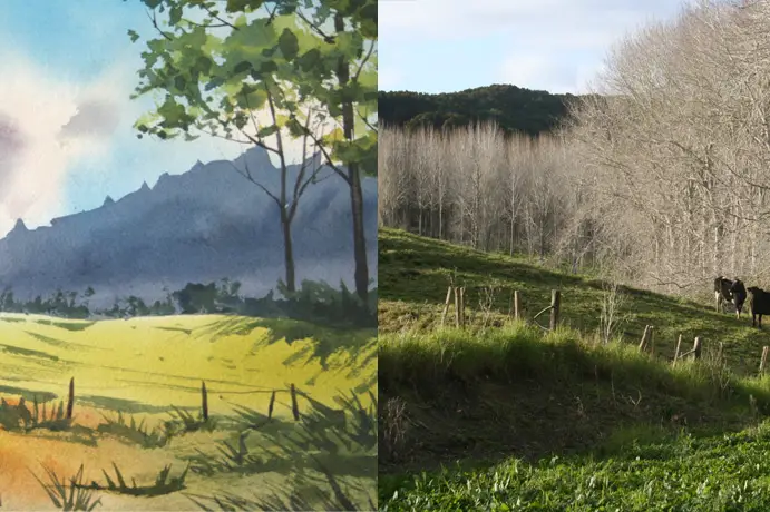
The Mistake: The colors in your photo reference don’t translate well to a painting.
How To Fix: If you’re using a photograph for reference, or even if you’re painting directly from life. It’s tempting to try and reproduce exactly what’s in front of you. But remember, you don’t have to be a slave to the photo or even to reality.
What looks good in a photo can look completely wrong in a painting. For instance, that distant row of trees in the image above taken from my painting “Morning Paddock” was way more green in the photo but the combination of green in the foreground and green background looked a bit monotonous. Pushing the trees closer to a purple hue achieved two things. 1) It created a pleasing color contrast with the yellowy greens of the foreground and 2) It made the trees recede more and gave a needed separation between background and foreground. This is because atmospheric perspective tends to cause distant objects to become more blue, so pushing background colors towards the blue even to the point of exaggeration still works.
21: Using Too Many Colors
The Mistake: Your painting looks like a patchwork quilt of colors rather than a unified whole.
How To Fix: In watercolor less is often more. This goes for color choices too. a limited palette is easier to control. like having having less balls to juggle with. Choose the overall color temperature of your painting. i.e. Whether it’s warm or cool and limit your self to a few harmonious colors plus an accent color.
22: Lack Of Preparation
The Mistake: You start enthusiastically painting but then find yourself panicking and making lots of mistakes.
How To Fix: Decide on the main colors that you need for your painting before you start. This means that you can mix them in the required quantity in advance. This saves you time and avoids you having to frantically mix additional paint to finish a wash before it dries. This goes back to planning and rehearsing your before you commit to the actual painting. Make color notes in your sketchbook so that you can reproduce them later.
Not having any kind of plan in mind for your color choices can cause you to experiment or make bad decisions when working under time pressure. Experimentation is a good thing of course but I feel that I experiment best when the stakes are low.
23: Trying To Blend With A Brush
The Mistake: In opaque painting media such as oils and acrylics it is common to blend colors with a brush but it doesn’t work well in watercolor. Although Wet in wet blending is not a problem., difficulties occur when trying to blend wet watercolor paint with dry. This can cause problems because when the water dries, it has a tendency to leave a hard edge behind.
How To Fix: Use subtractive blending, this technique technique, also known as “Lifting out” works well. Use a damp brush to pull off areas of paint, leaving a lighter area. Let the medium do the work for me where possible and drop wet paint in to wet paint and use your brush as little as possible. Too much brushing can drain the freshness and life from your paintings.
Example 1. Below shows what happens when you try and blend with a brush. Example 2 Shows wet into wet blending.
24: Lack of Contrast
Watercolor is well known for its subtle characteristics but it can be easy to forget that one if its most powerful strengths is the ability to create strong contrasts. These can be strong contrasts of tone or color.
25: Not Doing A Tonal Sketch
As watercolor is such a transparent medium. In general, you need to paint from the lightest to the darkest tones as you can’t paint light over dark like you can with Gouache or oils. This is often simply a matter of working from the background to the foreground In a simple landscape for instance the scene will tend to naturally work this way. eg Sky (lightest) Background, Midground Foreground. but it may not always be the best approach.
For more about value patterns and how they can help you plan a painting tonally, Please check out this post on how to paint landscapes
Trees can have thin pale branches in the right in the foreground and water can have a myriad of reflections and contrasting elements that complicate the order. Again, a little rehearsal to help formulate a plan of action is always helpful. Maybe there are elements that need to be scraped out of dark paint or masked off with tape, or masking fluid. Having a no-stakes trial run will help you no end in the actual painting.
Work out your tonal plan with a thumbnail sketch about the size of a business card. I do these tonal sketches in a neutral brown or grey sometimes with grey felt tip pens.
26: Overworking Your Painting
The Mistake: Trying to “Fix” your paintings by adding more and more until they have lost any feeling of spontaneity.
How To Fix: Knowing what to leave out of a painting is as important as knowing what to put in. This can be very subjective and depends on your personal style. It’s always tempting to keep fiddling and adding more and more detail in an attempt to save a painting that you feel is failing. Beyond a certain point, you risk overworking the picture.
Try to err on the side of simplicity and freshness. Be mindful of every brushstroke, visualize it in your mind before you put brush to paper, be ruthless with yourself, if you’re not certain that it will improve the painting in some way, then do nothing.
Walk away from your painting for a while then come back to it the next day. You’ll see it with fresh eyes and be able to asses in a more objective way how much more, if anything, needs to be added.
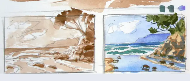
27: Trying Too Hard To Fix Mistakes
The Mistake: Attempts to fix watercolor mistakes often seems to make things worse. Paint can be “lifted out” to a degree but usually causes some damage to all but the most robust papers. Painting over a problem area sometimes works but usually results in a muddy mess.
How To Fix: Try cropping out an offending area. The seascape below once had a wonky looking surfer in the foreground but a bit of judicious cropping got rid of him along with the sandy beach which I was happy with unfortunately. Losing the foreground sand didn’t stop the painting from selling though!
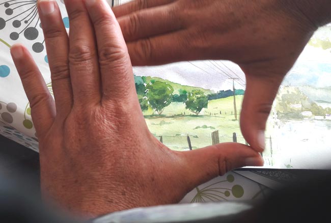
This might throw off your carefully balanced composition of course, so before you have at it with a steel ruler, and a Stanley knife, take a moment to think about the new composition you are creating. Frame the picture between your hands. Your painting will end up smaller and not quite how you envisioned it but a small painting is better than no painting at all. Right?
Be philosophical about it. After all, oil painters can chain themselves to the easel for weeks, months even. All just to finish one painting. If your painting doesn’t work out, what have you really lost? A couple of hours and a sheet of paper ( You can probably still paint on the back of it) and you’ve gained some invaluable experience. My advice is, if you can’t live with it, hide it, or crop it out, then toss it out. Then make sure to jump straight back on that horse tomorrow.
28: Not Separating The Planes
The Mistake: Your watercolor painting have no sense of depth.
How To Fix: Always think in terms of three basic planes. Background, Midground and Foreground. Decide where each one starts and ends and assign a tonal value to it. i.e. dark, medium and light.
You also need to factor in aerial perspective. Aerial perspective is a fancy term that simply refers to how colors change as they recede in to the distance generally becoming bluer and paler. A background tree will be less saturated. (i.e. The intensity of the color will be less) it will be bluer and also less detailed. So there is no need to show every leaf and branch.
Save the most detailed elements, strongest pigments and biggest contrasts for the foreground and focal points of your paintings.
29: Boring Flat Washes
The Mistake: Large areas of uniform color make your paintings look amateur.
How To Fix: Try to incorporate variegated washes and graduated washes into your work i.e blending different tones and subtle color variations into your washes. This makes your paintings look more interesting and professional. Skies are obvious candidates for a graduated wash of dark to light blue but generally speaking, scenes in nature don’t tend to have large areas of uniform color. A green field will have ridges and dips, patches of weeds, different types of grass, bare earth showing through in spots causing all manner of tones and shades of greens, yellows and browns.
30: Not Controlling Wet into Wet Areas
Wet into Wet painting is the classic signature technique of watercolor painting. Allowing two or more colors to mix and blend in unpredictable ways is a wonderful process. It’s like watching the painting create itself. Those wet into wet areas need to be tightly controlled so they don’t bleed into other areas where you don’t want them. In practice, this isn’t too difficult to do. Watercolor will only bleed into areas of the paper that are wet. So make sure that any bordering areas are completely dry when you paint next to them.
31: Painting Too Slowly
The Mistake: Your washes are streaky and uneven because the paint dried before you could finish them.
How To Fix: Watercolors need to be painted quite briskly as once it dries it essentially becomes inert. Try and moderate the temperature of your working environment as a hot studio will dry your paintings faster. Keep an eye on your washes and make sure they have a good “Bead”. The bead is the line of water that forms at the base of a wash. Once it dries you can basically give up on that smooth even coverage you were trying to achieve. You will almost inevitably see a distinct band of color in your wash.
Related Post: How to paint a perfect flat wash in watercolor
32: Forgetting To Leave White Space
The Mistake: Watercolor is transparent therefore you can’t paint light over dark for instance, if you painted a blue sea and then decide you need some white sparkles on the surface of the water.
How To Fix: You can lightly scrape away the surface of your paper with sandpaper to create this effect. You can also scrape out white highlights with a sharp knife.
Resist the temptation to cover the whole of your paper in unbroken washes of color. leaving a little white paper to show through in appropriate spots, e.g. flecks of foam on the sea or a scattering of daisies in a spring meadow, adds a touch of sparkle and freshness to your work.
33: Being Too Scared To Make Mistakes
As my dad used to say. “The person who never made a mistake, never made anything”. It’s important to make mistakes. Don’t be too hard on yourself for making them. More importantly, learn from them. Sometimes a mistake can turn out to be a blessing in disguise a “Happy accident”. Or it can teach you a technique that you can use in a different context or it might just teach you not to do that again. You will learn more from making mistakes than reading a dozen books.
34: Colors Are Bleeding Into Each Other
The Mistake: Your sky is starting to bleed into your foreground because you painted into a wet area with wet paint.
How To Fix: If you are quick, you can take a paper towel and fold it. Place the folded edge on the edge you want to preserve and make a wall to soak up the bleed. When it’s dry, if your edge is still a bit fuzzy you can attempt to fix it by carefully color matching and repainting.
35: Giving Up Too Soon
Some of my favorite paintings were ones that I nearly abandoned early on. The addition of a little bit of foreground detail or a few shadows in the right place were enough to tip the balance from bad painting to good painting. It’s always worth pushing through to some sort of conclusion even if you end up discarding the painting at the end.
Also, don’t give up to soon on watercolor as a medium. That breakthrough you’re looking for may just be a painting or two away. Watercolor requires a work fast, fail fast, move on mentality. You will get there if you stick at it.
In conclusion. I had to learn to accept that it’s impossible to ever have complete control over a watercolor painting. A year and a half on, from starting on this watercolor journey, I’ve learned to embrace the chaos. There wouldn’t be any fun without it anyway. When you eliminate the unpredictable, you also eliminate the possibility of “Happy Accidents”. and with it, the power of having a piece your own work take on a life of it’s own and truly surprise and delight you.
Recommended Reading
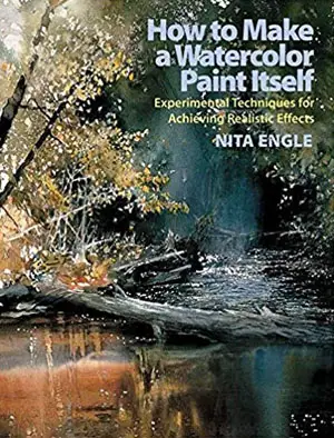
Nita Engle’s book is like a textbook on how to create “Happy accidents” it will make you think about watercolors in a completely new way.
Buy “How To Make A Watercolor Paint Itself” on Amazon
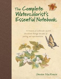
Buy The Complete Watercolorist’s Notebook from Amazon

Buy Zoltan Szabo’s 70 Favourite Watercolor Techniques from Amazon

Whenever I do skies with two or more colours they create a ‘cauliflower. I wet the paper but perhaps it should dry a little or my paint is too thin. What can I do?
Hi Nigel.Thanks for the question. Cauliflowers don’t usually occur when painting purely wet into wet. They tend to occur when the paper is partially dry and then you add a very dilute colour. Cheaper (Wood pulp) paper is also very prone to cauliflowers as the water tends to float on the surface for a longer time than 100% cotton papers. These posts might help 10 ways to fix-mistakes and this post on Watercolour paper