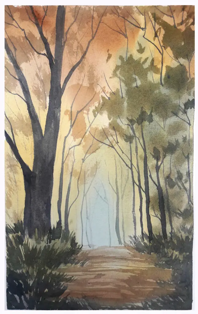
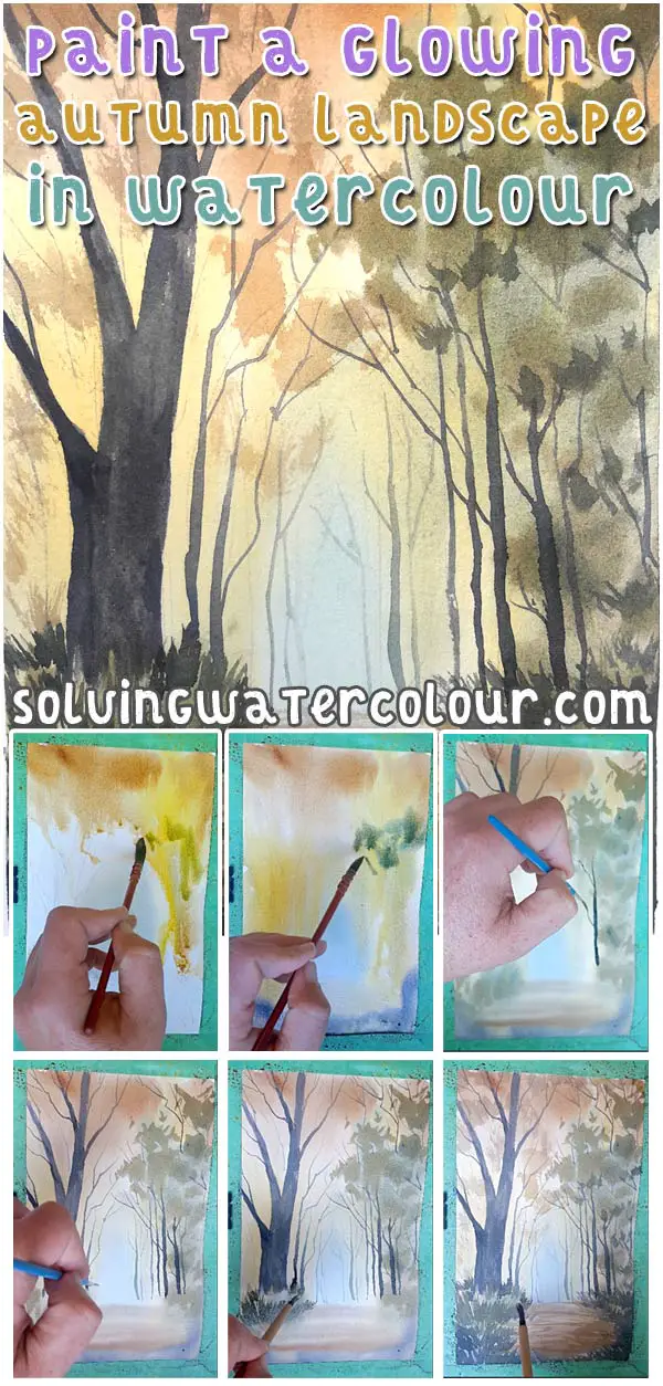
Autumn is definitely my favourite time of the year. I love the colours of nature and the quality of the light. For this watercolour autumn landscape painting, I wanted to create the impression of sunlight shining through Autumn trees and lighting up a woodland path with a luminous glowing effect.
To create that hazy glowing effect, the overall strategy was to start with a central spot of pale blue/green which would serve as the focal point of the painting and then paint loose washes of warm colour around it.
Materials List
I’ve linked to where you can purchase the paints and the other art materials I used from Amazon.
Cerulean Blue: Winsor & Newton | Daniel Smith
Ultramarine Blue: Winsor & Newton | Daniel Smith
Prussian Blue: Winsor & Newton |Daniel Smith
Paynes Gray: Winsor & Newton | Daniel Smith
Raw Sienna: Winsor & Newton | Daniel Smith
Burnt Umber : Winsor & Newton | Daniel Smith
Cadmium Yellow: Winsor & Newton | Daniel Smith
Cadmium Orange: Winsor & Newton | Daniel Smith
New Gamboge: Winsor & Newton | Daniel Smith
Alizarin Crimson: Winsor & Newton | Daniel Smith
Brushes
Mop Brush (Princeton Artist Brush Neptune, Series 4750, Quill Synthetic Squirrel, Size 4) Buy From Amazon
Winsor & Newton No.6 Round Bamboo Brush (Great for grass and foliage) Buy from Amazon
Rigger Brush ( For thin tree branches etc) Buy from Amazon
1″ Flat Wash Brush Buy From Amazon
Paper
Arches Watercolor Paper Block, Cold Press, 9″ x 12″, 140 pound Buy from Amazon
Misc
Easy release painters masking tape Buy from Amazon
Watercolour Palette Buy from Amazon
Fantasea Misting Spray Bottle Buy from Amazon
Please click here for a complete list of my recommended art supplies.
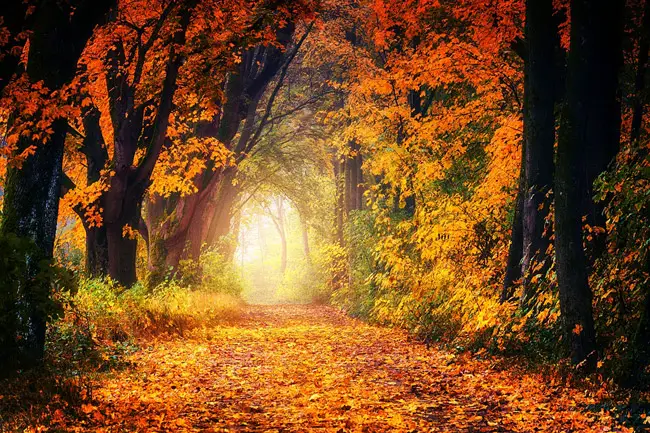
The image above is the reference image I used for thepainting. There are a number of technical challenges to overcome in order to paint the scene as presented.
For instance, should mask out some of those leaves with masking fluid to have them in front of the dark trees. In the end I just went for a loose interpretation rather than worry about making it exactly like the image.
The main thing I wanted to capture was that central glow of light. So I decided to start with that and work around it wet into wet as much as possible while preserving that area of light.
Preparation & Colour Mixing
Although I would normally paint with my paper at a thirty degree angle, or thereabouts. This time, I had the angle set closer to seventy degrees. I’m planning to paint fast and loose and having a steep angle like this will encourage the paint to quickly flow down quickly.
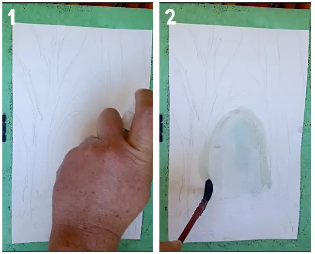
I’ve lightly pencilled in the placing of the larger trees and indicated where the ground is but that’s all. The whole point is to encourage myself to be free and loose so I didn’t want to nail things down too tightly at this early stage.
(Pic1) Rather than wet the paper completely, I gave the paper a good spray with water from my misting spray bottle. This will create a nice random mix of hard and soft edges and I will use more spray as and when I need to get the paint moving in case it gets “Stuck” in any areas.
In order to facilitate decisiveness and speed, I’ve primed my palette before I start painting. To put it simply, I’ve placed good sized blobs of all the colour I am going to use on my palette and given them a good spray of clean water to keep them moist but I’ve stopped short of actually pre-mixing the colours, because I want the freedom to mix as I paint and also allow colours to mix freely on the paper.
So for instance, if want a green I can paint yellow directly on to the paper then add blue over the top and spray with water if necessary and just allow them to run together and mix freely. This is a fun and exciting way to paint, as you never quite know what will happen. It tends to create a lively energetic painting as opposed to one that is stiff and overworked.
When you work this way, it’s important to keep the colours that you intend to mix together in separate palette wells from the colours that you don’t intend to mix together. If complementary colours end up mixing, the result will be mud! If your intention is to mix muted colours that’s fine but in this painting I want to keep my colours clean and bright.
For a detailed look at colour theory and how to mix watercolours to get the results you intend see my previous post here.
(Pic 2) I painted the lightest colour first. A bright spot of pale Cerulean Blue. This establishes the focal point of the painting – the view along the path through to where the trees end, where some pale blue sky can be seen.
Adding The First Washes
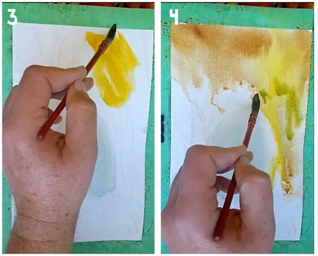
(Pic 3) With a No.4 brush, I painted a bright splash of Cadmium Orange in the top right hand corner. The edges are staying hard and clearly defined, not really diffusing at all, so I had to give it a quick spray of water to get things moving (Pic 4). The plan is to have the darker tones around the outside edge and the lighter colours at the centre. That way, I planned to create a glowing effect with a bright centre.
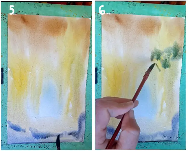
(Pic 5) I worked my way around the outside of the painting with Plenty of Burnt Umber and Raw Sienna. At the bottom edges of the paper, I painted a cool purple mixed from Alizarin Crimson, Ultramarine Blue and Paynes Gray.
With those purple washes, I’ve laid the foundation of where the ground shadows will be. Purple and yellow are complementary colours so this should create a nice contrast as long as they don’t mix too much and cancel each other out.
(Pic 6) I added in some green foliage on the left hand side.
The paper is now entirely covered in washes of colour. Time to let it dry a bit. Not thoroughly though, because I still want the colour to gently diffuse.

Adding Midground Foliage
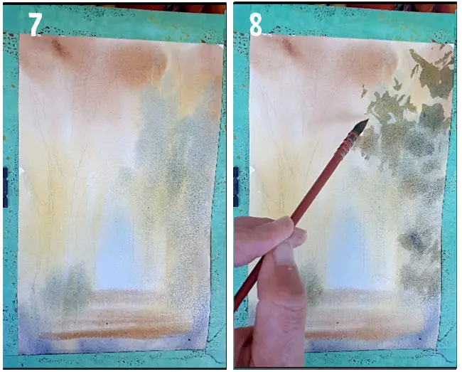
In (Pic 7) above you can see how much the vivid colours have faded back as it has dried. This will always happen, so it’s important to be aware of this and know that you have to compensate for it. So don’t be afraid to use brighter and bolder splashes of colour than you think you need. By the time the painting dries these will have toned down by about 25%.
As I’ve mentioned before and covered in a lot more detail in this previous post on landscape painting. It can help to think of your paintings in terms of a background, midground and foreground and give each one a distinct tonal value. In this painting I’m doing that, plus I’m also attempting to mimic the focal length of a camera lens. The background is the most blurred and out of focus. Then, as we move towards the foreground, the details become sharper and clearer.
(Pic 8) I’m now adding some more foliage with a mix of Cadmium Yellow and Ultramarine Blue to what could be considered the midground of the painting. The paper is moist but much less wet than before so the colours will gently diffuse but not run wild. You can judge when the time is right by observing when the shine goes off the paper.
Foreground Trees
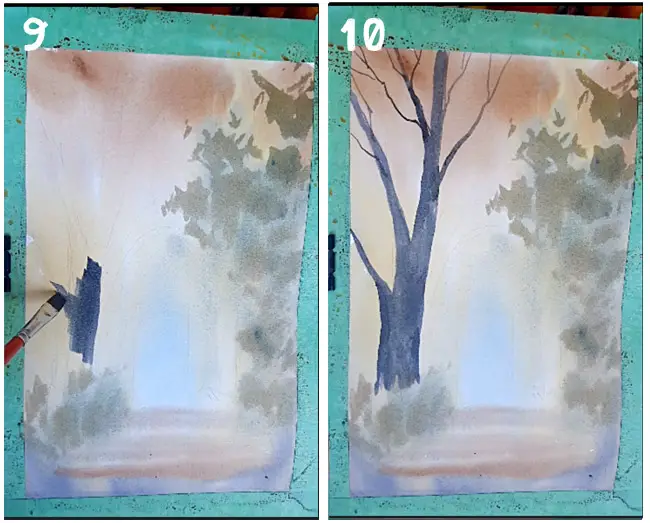
(Pic 9 & 10) I gave the trees in the foreground a strong cool purple/blue colour. This was mixed from Prussian Blue, Alizarin Crimson and Paynes Gray. This was partly to emphasize them and give them a stronger contrast with the lighter warmer background elements. Don’t automatically reach for the earth colours such as Burnt Umber, Raw Umber etc when it comes to tree bark. As long as the tonal value works, you can use almost any colour you like. Tree bark can range from shades of gray and green to blue depending on the type of tree and the quality of the light.
I used my flat brush for the trees. I could have used a round brush but I like the knife-like precision you get with a flat brush. You can use its wide face for the thickest part of the trunk and then turn it on its edge for thinner branches. For the really thin branches I switched to the Rigger.
Finishing The Trees
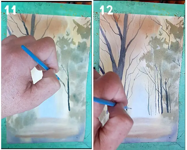
(Pic 11) With the large tree in place it was just a matter of continuing with with the rigger and adding more of the thinner background trees.
(Pic 12) I diluted my mix to paint the more distant trees as tones. Colours will become paler and more blue as they recede into the distance.
This previous blog post has a lot more tips on the specifics painting trees.
Foreground Details
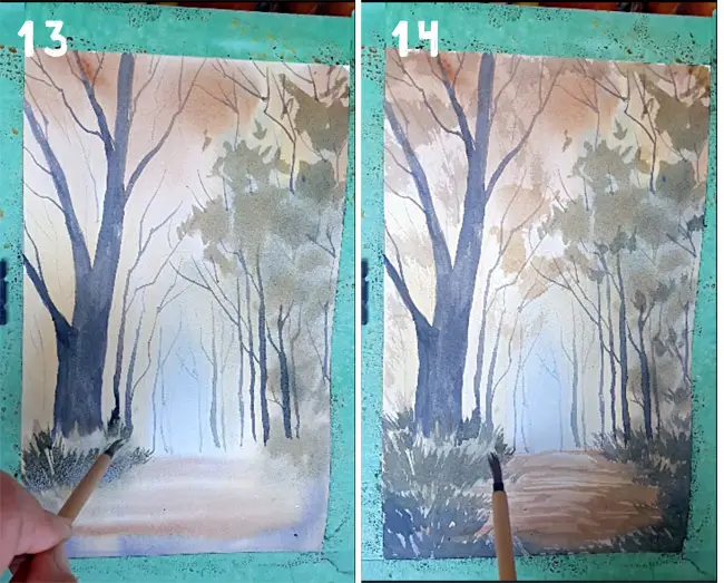
So, what appeared to be a chaotic mess at the start has come together at the end. In fact it’s been a pretty methodical process all along. A process of working from background to foreground. From broad and loose, to tight and detailed.
(Pic 13) A Bamboo brush with it’s loose floppy bristles is my choice for painting the foreground grass and small areas of tree foliage. I’m partially mixing my greens on the palette and partially letting them mix on the paper. Your greens will look more natural if you allow them to have a good range of tonal variation. My green is basically just a mix of Ultramarine Blue and Cadmium Yellow but I’ve allowed some Burnt Umber and Raw Sienna into the mix to warm my greens up.
I want this painting to lean strongly to warm earth colours and I was worried about allowing an overly cool green to dominate the foreground the foreground might end up tipping the balance the wrong way.
(Pic 14) The final touches were just glazing some hard edged rough brushstrokes of weak Burnt Sienna to the path to indicate some fallen leaves and shadows on the ground.
Remember that watercolour is a transparent medium and transparent glazes can get muddy and dark quite quickly. So it’s always good to err on the dilute side when adding glazes of darker earth colours like Burnt Sienna. Like salt in food, you can always add more but you can’t take it out.
As a bonus I’ve included the timelapse video of this painting. In real time the painting took me about 20 minutes not including drying times.
If you found this post useful be sure to check out these posts on landscape painting too.
How To Paint A Glowing Autumn Landscape
How To Paint A Winter Landscape
Easy Watercolor River Painting
Pro Tips For Plein Air Watercolor Painting
How To Paint A Loose Watercolor Landscape
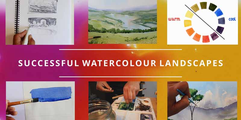
Successful Watercolour Landscapes: Online Course