For me, even a simple landscape painting needs to have three basic elements. A foreground, midground and background. How those three elements are handled will determine the overall success of your painting. Bearing this in mind, lets look at some different ways we can approach painting a simple watercolor landscape painting .
Art Supplies List: Here are the main art supplies I used for this tutorial.
Faber-Castell 4B Pencils Buy from Amazon
Pro Arte Prolene Synthetic Flat Brush
Winsor & Newton Series 150 Bamboo Brush (Great inexpensive brush,
ideal for painting foliage) Buy from Amazon
Princeton Select Script Liner Brush (A “Rigger” style brush perfect for thin branches and blades of grass) Buy from Amazon
Princeton 1″ Flat Brush (For laying in skies and large areas of colour) Buy from Amazon
Winsor & Newton Professional Watercolor Tube Set. Buy from Amazon
Moleskine Art Watercolor Album Buy from Amazon
Arches Watercolor Paper Block, Cold Press, 9″ x 12″, 140 pound Buy on Amazon
Pebeo Palette Knife (Useful for scraping out branches) Buy from Amazon
Winsor & Newton Art Masking Fluid Buy from Amazon
For a full list of recommended art products please see this post
Assigning Tonal Values
In just about every painting I do, not just landscapes I find that it helps to think in terms of three basic tonal values. light, mid and dark. By assigning a tone to each element you can instantly simplify everything. You can choose to order your painting in a way that best conveys the “Story” you want to tell.
So which values should we assign to which elements?
Generally speaking. Things tend to appear lighter the further away they are. So it makes complete sense to put the lightest values in the background the middle values in the mid ground and the darkest values in the foreground. Think of this as the default pattern, or starting point when thinking about structuring your paintings in this way.
Photographic References
The main problem with painting from a photograph is that the camera never quite captures the things what made you want to paint the scene in the first place.
When we physically experience a place we’re using all our senses and our brains are selectively editing all the information that’s coming to us and focusing on and enhancing various aspects of it in real time. We have wide peripheral vision that adds a panoramic perspective.
The photograph is a pale imitation of life. The lens compresses a 3 dimensional multi sensory experience into a little box. A two dimensional rectangular representation of the original experience. The colours are never quite as vibrant as we remember them, and the tones never quite as distinct and separate.
Creating A Painting From A Photo
In the photo below, very little that caught my attention at the time seemed to actually make it into the picture.
The tree standing out with it’s skeletal branch structure starkly contrasted against the surrounding foliage is now just kind of standing there unobtrusively. The way the light fell on it and a multitude of other subtleties completely failed to be captured in this photo.
Now I just accept with photos we’re at a disadvantage from the start. As an artist I just want to interpret the photograph rather than try and copy it.
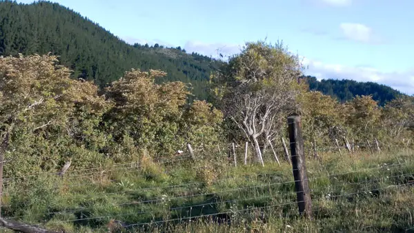
A straightforward copy of the photograph wasn’t going to work anyway for several reasons.
There’s a little bit of bright sky and a broad mass of dark green which all just sort of lumps together. The tree I liked is just kind of lost in the middle of it all. The fence post competes for attention with the tree and doesn’t really add anything at all.
Experimenting With Tonal Values
Despite what I said about tonal values before. The fact is, we can assign any value to any element and it will work. This is great news, because we now have six possible options for ordering the values in our paintings and each one has the potential for a distinctly different visual statement.
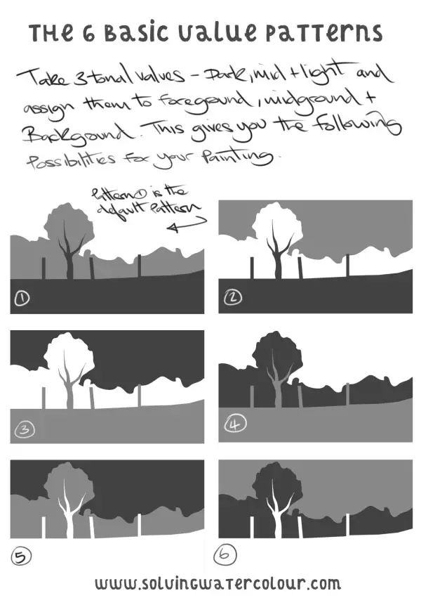
After trying out various tonal patterns in rough pencil sketches and loose thumbnails I’ve decided that Pattern 6 is the one I like best. Pattern 6 highlights the tree trunk and branches in the clearest way.
This choice is obviously somewhat objective. I could, for instance, have gone with the Inverted version (Pattern 2) as that also gives an equally wide contrast between the tree and it’s immediate surroundings but the “Story” of this painting is about the paleness of the tree branches. So Pattern 6 it is.
Rough Sketching & Experimentation
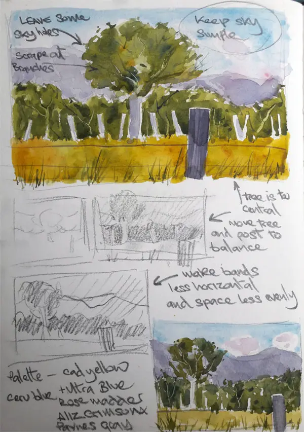
In the sketches below I’ve done a colour rough and made some notes to remind myself of what to do when I come to paint the final thing.
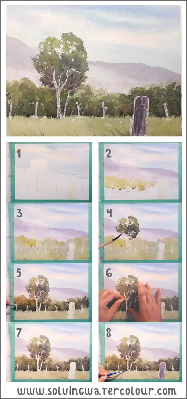
- 90% of this painting is done with a cheap Bamboo brush. I’ve sketched out my composition on the paper and masked off the tree and the line of fence posts and also the fence post in the foreground with masking fluid. I’ve layed in the sky with a pale wash of Cerulean Blue and Ultramarine Blue. You’ll see that I’ve moved the tree from where it was, in the centre of the photograph to a position about one third in from the edge of the paper. This is in accord with the rule of thirds. (If you’re not sure about the rule of thirds, this website has a useful explanation with good examples https://digital-photography-school.com/rule-of-thirds/ ).
- In these previous blog posts about colour mixing and painting trees, I addressed the issue of the colour green and how overpowering it can be in a landscape painting. To provide a warmer contrast amongst the predominantly cool colours. I’ve changed the dark green pine forested hills in the background to a light purple, using a mix of Ultramarine Blue, Alizarin Crimson, and Paynes Gray. I’m also starting to lay in a variegated wash of light green made from mixes at different strengths of Cadmium Yellow and Ultramarine Blue and Raw Sienna and Paynes Gray.
- My light green variegated wash is completely layed in now and I leave it to dry.
- Using a darker wash of variegated greens blues and purples I move on to the tree foliage. I also add this second darker wash to the adjacent mid ground foliage.
- The dark mid ground now established I leave it to dry and go in and add my darkest shades of green. I’m putting this darkest colour around the base of the foliage, i.e. where there is the most shade. While the paint is still wet, I scratch out some thin branch shapes with my palette knife. I could have painted them in later with white paint but I prefer to avoid doing that if possible. I’m also adding in details like blades of grass etc. Because I need to be a bit more accurate with my brush work now, I’ve switched to a small round brush.
- It’s time to carefully remove the masking now. It’s really important not to tear the surface of your paper. This could potentially ruin your painting. I carefully rub the edges of the masking film with my finger (Make sure that the paint is completely dry and your fingers are completely clean and free from any grease) and slowly pull the film away. If all goes well it will all come away smoothly in one strip.
- I’ve removed all the masking film leaving the last areas of white paper exposed.
- All that’s left now is to paint the white areas. Using a small round brush again for accuracy. I add some bark texture to the trees. I’m using the dry brush technique here with the brush held horizontally and dragged upwards. I paint the foreground fence post with a flat brush. I turn the flat brush lengthwise in order to add the straight lines of wood grain and the painting is finished. Finally, using a rigger brush ( See this post on brush types). I add some darker tree branches and blades of grass.
I’ve uploaded the video of me painting this to my youtube channel. While you’re at it, please go ahead and subscribe!
Landscape Painting Composition
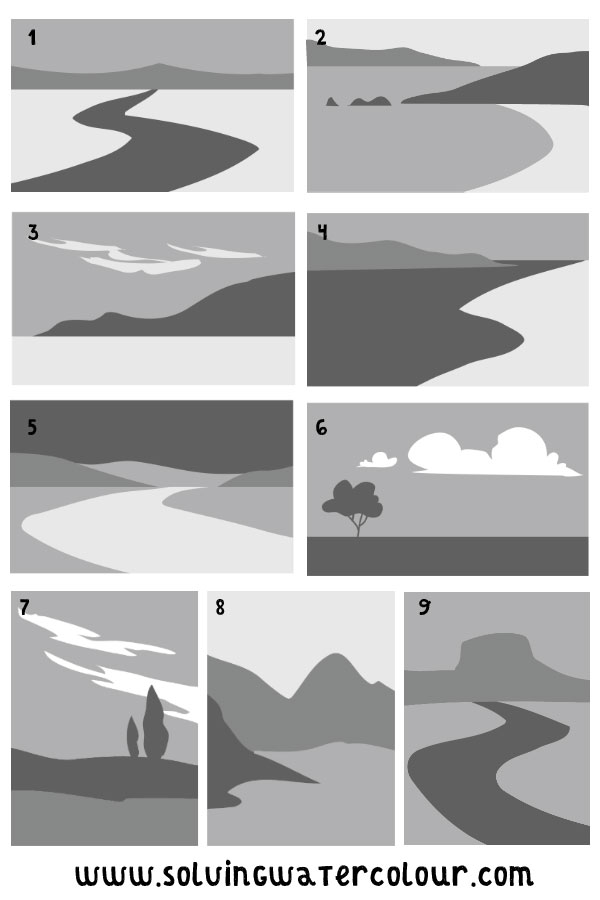
There are many ways you can compose a landscape.
The examples below show some of the infinite variety of possibilities that are available to you. In addition to the separation of tonal values that I’ve previously discussed they all utilise the rule of thirds in some way. It can be the placement of the horizon line or the placement of a dominant element within the painting.
Lead Ins
Several of the examples below include a “Lead-In”. This is simply a curving line which draws the observers attention into the painting and directs it towards a focal point. Example 1, 5, and 9 have obvious lead-ins or it can be more subtle as in examples 2 and 4.
Paper Orientation
In art classes at school our teacher would often say turn your paper landscape or portrait (meaning horizontal or vertical) but as in examples 7, 8 and 9 there’s no reason why landscapes can’t be vertical. Especially if you, like me, are a lover of big dramatic skies. Then you need to have room for them. One word of advice though. Skies shouldn’t compete with the land for your attention so if there’s a lot going on on the ground then keep your skies relatively simple.
Balance In Composition.
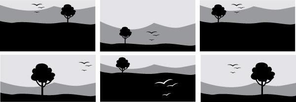
Balance in painting is often explained as being comparable to the balance on a set of weighing scales.
On a weighing scale, two different weights can be made to balance by changing their positions relative to the fulcrum point. Likewise differing size elements in a painting can look balanced or unbalanced depending on their relative positioning to the central axis of the paper.
I’m not sure that it’s an entirely helpful analogy though. The examples above don’t necessarily perfectly balance but I think they all work.
What Affects The Balance Of A painting?
For me, the problem with the set of scales analogy, is that it could imply that a perfectly symmetrical painting would have to be a good composition because it’s perfectly balanced. When in actual fact it would look very stiff and formal. In the context of a brochure that might be perfectly appropriate but not necessarily so in an impressionistic painting. So there’s more to it than just balance.
To take the idea of balance further. It’s worth understanding that visual elements can be made “Heavier” or “Lighter” not only by their size and shape but also by how high their contrast and colour is in comparison to other elements.
I believe that it’s better to simply experiment with different combinations of size, shape, tone and colour relationships in order to develop your own design sense, rather than worry too much about formal ideas of balance.
Negative & Positive Space
What do I mean by negative and positive space? To put it simply. Positive space is the area of your painting that contains something. e.g. a person, a rock, a bowl of fruit. In other words, the areas of interest. Whereas negative space is the space around those elements. e.g. The sky , a table cloth, the gap between two trees. A simpler way to think about composition is this.
Composition is the art of placing elements so that the eye is drawn to them and not the spaces between them.
If you found this post useful be sure to check out these posts on landscape painting too.
How To Paint A Glowing Autumn Landscape
How To Paint A Winter Landscape
How To Paint A Vivid Forest Watercolor Scene
Easy Watercolor River Painting
Pro Tips For Plein Air Watercolor Painting
How To Paint A Loose Watercolor Landscape
Successful Watercolour Landscapes: Online Course
That’s all from me for today. If you have anything to add tips, things you agree or disagree with. let me know in the comments below.
Recommended reading
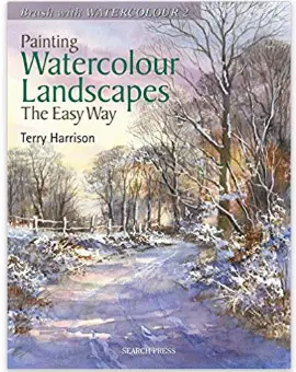
Painting Watercolour Landscapes The Easy Way By Terry Harrison
Buy on Amazon
How To Make A Watercolour Paint Itself By Nita Engle
Buy On Amazon



This is great, thank you!
Thanks! You’re welcome
Really useful tips. Thanks for taking the time to put this together
Thank you Ed!
One of the best explanations of important elements in a painting I have read yet. Thanks so much
Thanks Linda!
Much as I know most of what you have covered here, I don’t always remember to use these strategies. I will print and keep your visual examples in my sketch book to remind myself to use them. Thank you so much, Andy.
Thanks for the comment Pam, I’m glad it helped you.
An amazing tutorial Andy, Thanks a lot. I have saved on my PC and have shared on Facebook.
Great Ralph, thanks for sharing it!