Do you sometimes feel like your watercolours are not progressing? You’ve been plugging away for months and you’ve got the basics down but somehow you’ve got stuck in a rut and you’re not seeing any significant improvement in your work. Don’t worry you can paint better watercolours.
Apart from the talented few, the progression of an artist is rarely a smooth straight upward trajectory. If you plotted a graph of the typical artists progress over time, it would look more like a series of long horizontal plateaus interspersed with occasional small jumps upward. Even those upward jumps get incrementally smaller as time goes on. Sometimes, you might even feel that your progress is going in reverse.
Don’t worry, that’s perfectly normal. Progressing as an artist can be likened to a series of mountain peaks . You reach the top of one only to realize that there is another, even higher peak rising up before you out of the mist.
What if your progress hasn’t just slowed though? What if it’s completely stalled and you’re considering giving up altogether? If that’s you, then I have some suggestions that may help. Some are easy some not so easy some are just psychological tricks. Some will need a greater level of commitment to improving your skills but they are all steps that have helped me at various points in my journey.
Adopt The Mindset That “Good Enough is Not Good Enough”
Sometimes we just stop pushing forward and get comfortable in our little rut. We tell ourselves, our work is good enough. Maybe we’re doing reasonably well, just coasting a long churning out work at the same level, maybe it even sells well. Inside though, you’re feeling an inner dissatisfaction. Deep down, you know that you just aren’t hitting your full potential and even though you can see that next mountain peak, you’re just not sure how to get up there.
The first step is making a commitment to what the Japanese call “Kaizen” Constant improvement. No longer will “Good enough” be good enough for you.
Paint It Again
Once you’ve finished a painting, is that it? Over and done with shove it in the drawer and move on to the next new thing? I used to do that too but I found that certain paintings would keep nagging at me. If only I’d just changed this sky or or if only I’d used a different colour scheme it could have been so much better.
If good enough is no longer good enough, then you need to start listening to that inner voice and paint it again. After all, watercolour is a really fast medium to work in. If oil painters are the Marathon runners of the art world, then watercolourists are the 100m sprinters. If you’re not happy with a piece, take a step back, analyse what went wrong and redo it. Version one probably didn’t take all that long to do and version two will be done in half the time.
You’ve already done the mental work. Deciding what to paint first. What colours to mix. Where the tricky parts are etc. So version two should require much less planning and deliberation.
Now I’m not suggesting that you become obsessed with perfection but I do suggest that you set yourself a mental hurdle. If I’m 80% or more happy with a painting. Then it’s done. Time to move on. If it’s less than 70%. I’ll sleep on it. Think about what I could have done better, maybe make a few notes on the picture and give it another go the next day. I don’t like to let it go for much longer than a day or two though, because I need to keep that mental image fresh.
I don’t mind admitting it. If I think a painting is worth persevering with. I’ll keep redoing it until I get it over that 80% hurdle. Some paintings I’ve redone up to ten times at different sizes with slightly different colours changing the horizon line a bit, trying a different approach for the sky tweaking this and tweaking that. You’ve just go to keep pushing to get the desired result.
Honestly Assess Your Drawing Skills
It’s hard to be completely objective about your own abilities but ask yourself the following. Are your drawing skills where they need to be? Good drawing is the foundation of good painting.
I hear some of you saying “But I don’t need to develop great drawing skills because my work is entirely non-realist”. That’s fine but be honest with yourself. Is your work non-realist because it’s simply what you love to do, or simply because it’s your only option?
Non-realist painters really need to have exceptionally good design skills and improving your drawing skills can only improve your overall awareness of design and composition.
O.K it’s time to ask yourself some hard questions.
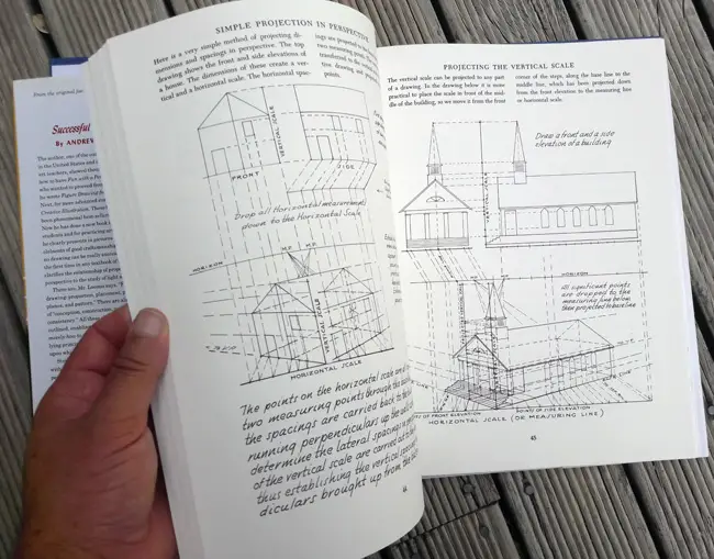
Do you understand Perspective? Not just in the vague way of “Stuff gets smaller the further away it is”. Do you really understand it? Could you, for example, produce a reasonably accurate three dimensional rendering of a building in one two, and even three point perspective?
Could you draw a human figure in proportion from a photograph? How about from life? How about, from your imagination, entirely without reference?
Could you draw a reasonably convincing likeness of an actual person?
So, you’re saying I need to master each and every one of those exact drawing skills to be a good painter? No. I chose those because they are about the hardest skills to learn and if you can master them then there’s nothing much that you won’t be able to cope with. I certainly haven’t mastered them all but I’m always working on them. So Just be aware of the limits of your drawing skills. Because it’s this, more than anything else, that will determine the limits of your painting skills.
There’s a list of links at the end of this post of books that I highly recommend for improving your drawing skills
Do Less
O.K. that was a tough pill to swallow, so here’s an easier one. Watercolour is a medium that can very quickly become overworked. This is mainly due to it’s transparency. For example, you painted an area that wasn’t quite right then you go back in and fuss and fiddle with it and before you know it, the luminosity is gone and you’re left with dark muddy mess. So what do you do? I suggest you do less of everything.
Use less colours. The more colours you use, the more they compete with one another for the viewers attention. Paint with fewer brush strokes. Use the largest paintbrush that is practical to use for the area you’re trying to paint. You’ll be able to cover the same area in less strokes.
Simplify scenes and put in less detail than you might be tempted to. Study the paintings of Edward Seago to see how much can be conveyed with confident economical brush strokes and the minimum of colour and detail.
Know when to stop, As the painting develops take frequent breaks and relax. Stand back and assess the impact of every brush stroke. Resist the temptation to keep adding more and more.
Design Your Paintings
Drawing skills give you the power to portray reality but design skills enable you to take that information organise it, abstract it and manipulate it to create an artistic statement. To give an analogy. If Drawing is the language, then Design is the story. The elements of design include but are not limited to colour, shape, proportion, balance, light and shade, texture, emphasis.
Colour theory was the subject of my previous post and you can read that here. Composition is a subject for another post and if you are interested in it there is a lot of information available online about that.
Suffice it to say that there is no rule that says you need to stick rigidly to your source material. Reality and reference photos can and should be altered to make your paintings better. It’s very rare that reality presents us with a perfect scene for painting. Rather than simply repeating what’s in front of you. The elements of design are simply the tools at your disposal to allow help you tell a better story.
Here’s an example of the process that I went through for a recent painting. “Walking to Narrowneck”
Below you can see my original reference photo. I’ve highlighted some of the problems with simply doing a straight rendition of it as a painting. The horizon line is a bit too close to the middle and this tends to split the picture in half. There’s a lot of clutter on the left side with the pylon and the trees etc. That whole area would benfit from being simplified to make a clearer statement. There’s also a lot of empty space at the bottom of the picture and it would be nice to put a figure in there to add a human element and give the image some more interest.
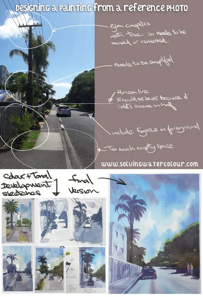
Below, you can see some of the tonal and colour studies that I did before completing the final painting. These weren’t all done at the exact samesize but were on average roughly postcard size.
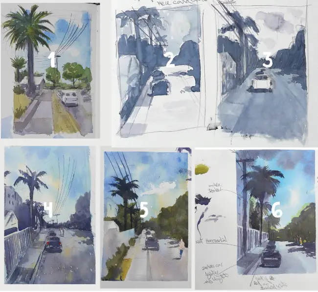
- This was my initial sketchbook colour study. Just to get a feel of what the final might look like. I decided that I really wanted to bring in a strong contrast and make a bolder statement. It was time to explore how that might look with some tonal studies.
- This first tonal study divides the image into light, dark and mid, tonal values and assigns these values in the following way . Background (Mid), Midground (Dark), Foreground (Light)
- This second tonal study swaps those values around and reverses the values on the car so that it doesn’t get lost.
- Another colour study. I decided that this wasn’t working as the blue violet was too dominant making the painting a bit too monochromatic.
- I’ve strengthened the blue sky, placed a figure in the foreground and lowered the horizon line. The muddy green clearly wasn’t working though!
- I’ve got a combination of colours that’s working much better now. I underpainted the entire scene in Cerulean Blue, Ultramarine Blue and a violet mixed from Ultramarine, Alizarin Crimson and Paynes Grey. I felt that the picture now had an underlying unity that was missing before. Overall the colours lean firmly to the cool side but I’ve. The bright yellow-green highlighting the trees was Cadmium Yellow and Ultramarine Blue. I included a little splash of Yellow Ochre on the small figure to provide a nice contrast against the violet. I’ve also scribbled a few notes to myself in pencil, highlightng issues that I found, so that I wouldn’t make those mistakes again on the final painting.
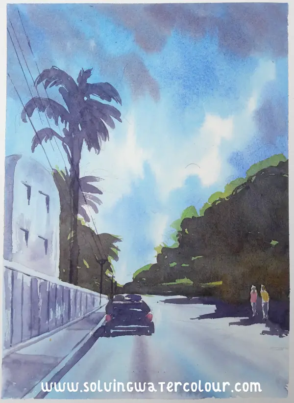
On the final version below. I’ve simplified things further and brought the figure closer to the foreground.
If you need some help trying to select appropriate art supplies for your needs I’ve put together a list of my recommended art supplies.
Keep A Sketchbook
A sketchbook is an essential item. Get into the habit of taking it with you wherever you go as you never know when you are going to come across an inspiring scene or an idea. You can treat it like a sandbox that you can play in to test out your ideas.
I record colour recipes in mine and make notes to remind myself what to do and things to avoid when I come to paint the “Real” painting. This means that I make less mistakes in my finished work because I’ve already worked through many of the potential stumbling blocks that I will encounter.
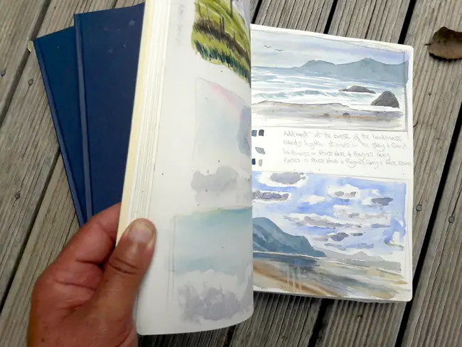
That’s not all though. Never underestimate the positive psychological boost that a flick through old sketchbooks can give you. As you fill each one you are creating an honest record of your artistic progress. When you think that you aren’t progressing your sketchbook stands as reminder and proof that you really have improved.
Seek Out Useful Criticism
Let’s face it , nobody enjoys receiving criticism, least of all us artists. But receiving criticism is an important part of our growth. Not all criticism is helpful though. So it’s important to solicit informed opinions. For instance You wouldn’t ask a chef to try and diagnose a problem with your car, so why would you expect to get any useful feedback about art from a non-artist.
For example. How does it help you if someone says, “I don’t really like those colours” or, “Those arms look a bit weird.”? On the other hand, if you’re told that “Those greens are a bit over saturated. Try muting them with a dash of red” or “Check the proportions of those arms. The elbow joints should be about level with the navel.” Then you’re receiving useful criticism that you can take action on.
Facebook groups can be a good source of informed feedback. Make sure that you make it clear that you are there for criticism not just virtual back pats. The ideal situation would be to seek out a mentor with a level of skill that you aspire to who can give you plenty of constructive criticism and actionable advice.
Recommended Drawing Books
Below are some of my favourite books on drawing. Do you have any suggestions that you think I should add to the list? Please let me know in the comments section below.
Successful Drawing, Creative Illustration : Andrew Loomis
Dynamic Figure Drawing, Dynamic Light & Shade, Drawing The Human Head: Burne Hogarth
Imaginative Realism How to Paint What Doesn’t Exist: James Gurney