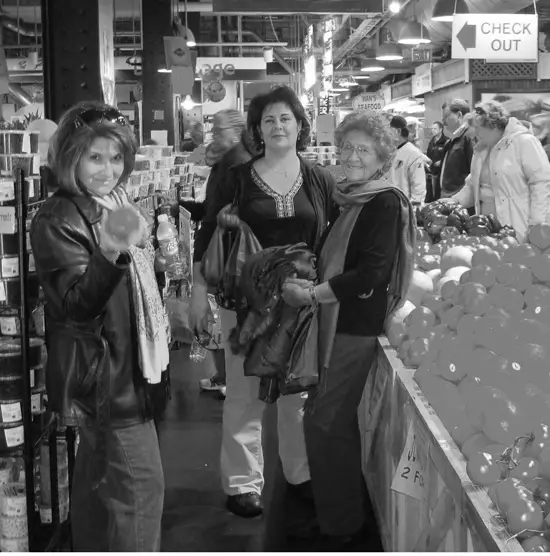
Antoinette has been struggling with painting the photo below, so she asked for some help with how to tackle it. The first thing I’d like to say is, well done for attempting this one, as it’s a very challenging subject.

There’s so much going on in this photo and painting figures is never an easy thing to do. Plus there are the added challenges of composition, perspective, tonal value and color to deal with.
Painting a subject like this requires some thought and planning so let’s break it down.
Disclaimer. This is only how I would approach it. There’s no right or wrong way to do this and a different artist might do it in a completely different way.
Perspective
Antoinette drew the sketch below to help her understand the perspective (The red annotations are my addition) but she realized that something wasn’t quite right. In her words, “I made it look like the people were on a hill vs a flat line.”

O.K. so why did that happen?
Perspective can be a confusing topic, so let’s simplify it. In a “one-point” perspective which is what we have here. Vertical lines stay vertical, horizontal lines stay horizontal and all other lines converge to a single imaginary point on the horizon line called the “Vanishing point”. “Horizon line” is simply another way of saying the viewer’s eye level.
Antoinette’s sketch shifted the position of the horizon line (Viewer’s eye level) upward and she drew some of the people on it and some below it.
Anything above the horizon line, we are looking up at and anything below the horizon line we are looking down at. This is why some of the people in Antoinette’s sketch look like they are standing on a hill and the viewpoint now appears to be from up in the air. Let’s go back to the original photo with perspective and horizon lines added.

Notice in the photo, how the horizon line passes through everyone’s head no matter how near or far away they are from the viewer. That’s because everyone in the photo is of a similar height to the viewer (Give or take a few inches) and is standing at the same ground level as the viewer.
For more on this see my related post
Composition
There’s a lot of advice out there on rules of composition. It can be really confusing trying to follow it all. Let’s just forget the “Rules” and think about it like Mr Ebdon, my high school art teacher used to explain it. He always said, a composition is good when your eye is drawn to the Positive space (Main subject) rather than the Negative space (The spaces in between and around it).
The main subject here is the three figures so let’s crop the photo to keep the focus on them and remove a lot of distracting detail.

Values

Making a black and white version of the photo to better see the values is a really good idea but remember that you don’t have to be a slave to the photo. We can change those values to suit our own artistic purposes.
We’ll come back to that in a minute.
Tonal Sketch
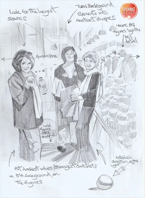
To help you decide how you’re going to paint this photo. The next stage would be to make a tonal sketch using a pencil and only 3 values, light medium and dark. Here’s mine.

I’ve kept the strongest contrasts and most of the detail to the main three figures in the foreground. I’ve made the values lighter and reduced the details in the background to avoid distracting the eye from the main subject. If your drawing abilities aren’t great then just lightly trace the outlines from the photo first. There’s absolutely no shame in doing that. Many of the old masters used a Camera Obscura as a drawing aid, which is basically tracing.
I hope that helps. In part two, I’ll take a look at how we get from a tonal sketch to a finished painting.


