Abstract art is all about capturing the essence of a subject without getting hung up on the formalities of realism. Think of it as inventing your own symbols. Flowers are the perfect subject for abstract painting, as their inherent geometry lends itself to the process of abstraction through simplification and exaggeration. With a bit of confidence and a bold but relaxed approach, anyone can get good results. Break out your brightest most vivid colors and go for it!
How To Paint Abstract Watercolor Flowers: Lilies
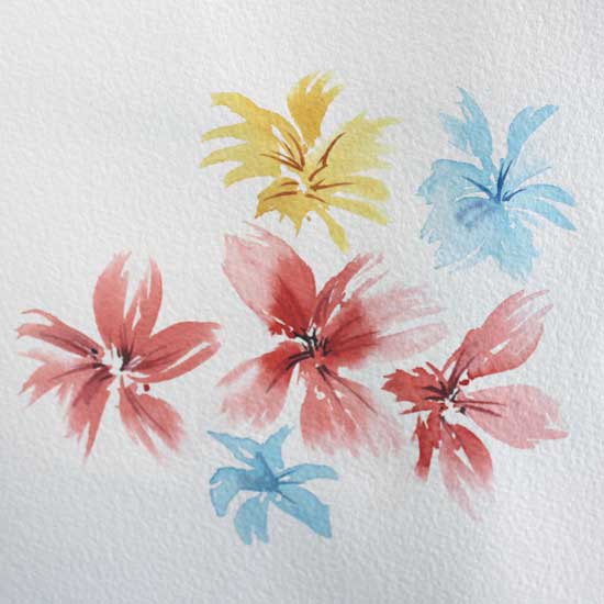
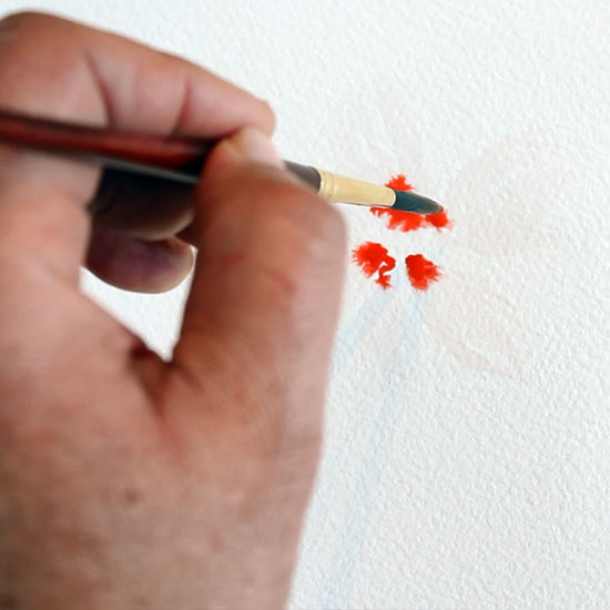
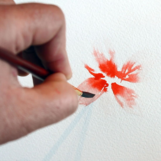
These beautiful abstract lily-like flowers are so quick and easy to create, they practically paint themselves! We will paint the petals using the “Wet in wet technique”. i.e. wet paint on wet paper. You will need to lay your paper down on a flat surface as opposed to the usual method of painting at a thirty degree angle. A tilted surface won’t work for this particular technique, as the paint needs to bloom out in all directions, rather than just down.
For a detailed explanation of the process of creating abstract art see my Related Post: How To Paint Abstract Watercolor 5 Inspiring Strategies
See also my Glossary of watercolor painting terms
Total Time Needed :
15
Minutes
Equipment:
Materials:
How to Paint Abstract Watercolor Flowers Step By Step:
Watch The Video

How To Paint Abstract Watercolor Flowers: Pansies
Brushes: 3/8″ Flat Brush . No.6 Round , No.2 Round
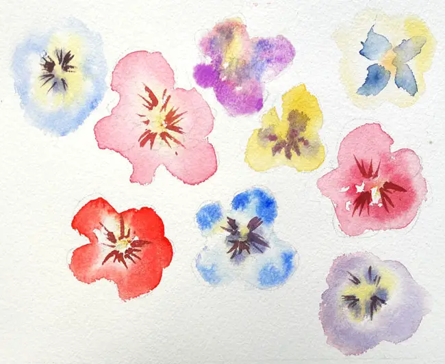
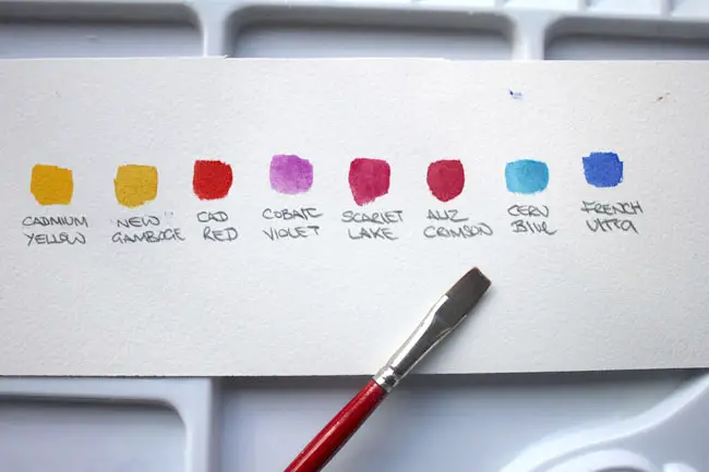
Color Palette Suggestions For Abstract Pansies
For these Multi-colored Pansies I’m using a palette of the brightest most highly pigmented colors I own. Feel free to make your own substitutions. “Artist series” colors tend to be the most expensive because they are the most highly pigmented and natural pigments are often pricey.
Below, I’ve put links to Amazon for my suggested floral color palette. These are paints that I feel offer the best value but are still great quality. Unless you are painting a lot of floral paintings I recommend that you go for the smaller sized tubes of specialized colors such as Cobalt Violet and Scarlet Lake as a little goes a very long way.
Cadmium Yellow
New Gamboge
Cadmium Red
Scarlet Lake
Alizarin Crimson
Cobalt Violet
Dioxazine Purple
Cerulean Blue
French Ultramarine
I’m painting on to a sheet of Arches Cold Press 140lb which is laid horizontally. laid horizontally as in the first example to create those ink blot like splashes of color that you often see on the leaves of a pansy.
I’m going to be swapping between several different colors. So to keep the colors bright and avoid any muddiness, it’s important to clean and dry the brush thoroughly between each application of color.
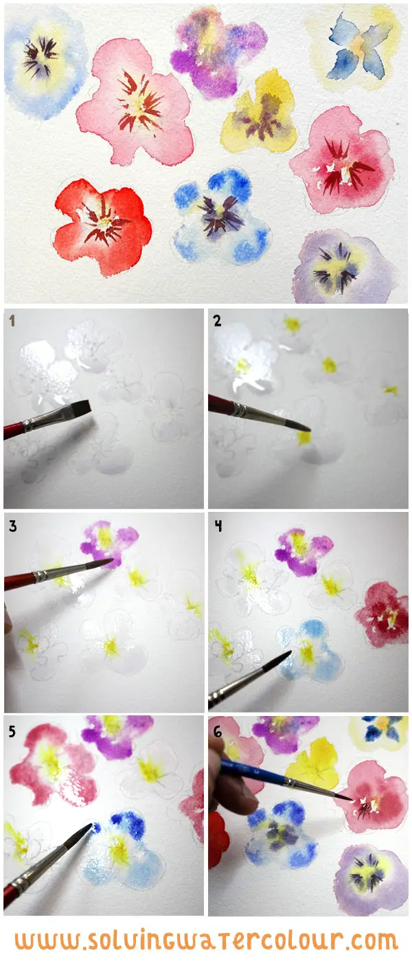
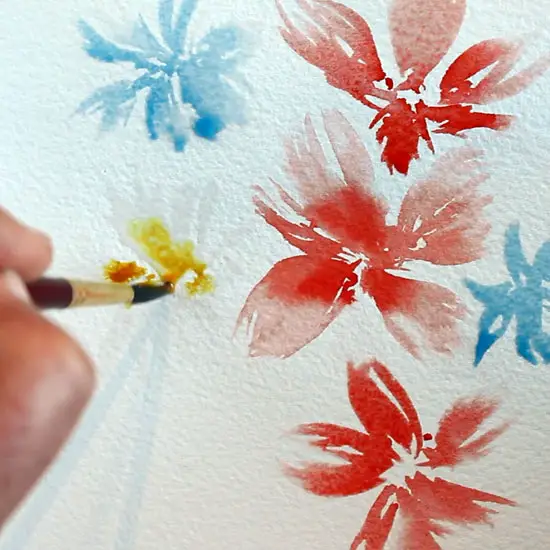
- Take a flat brush and paint the pansy shapes just with fresh clean water. I’ve used a flat brush because I like the way I can make crisp controlled hard edged shapes with it. I could have used a round brush, or anything really. It’s purely a matter of personal preference.
- With a round brush, Dab the center with some Cadmium Yellow, this will immediately starts to bloom outwards.
- Work around the outside of a shape and allow that color to spread inwards.
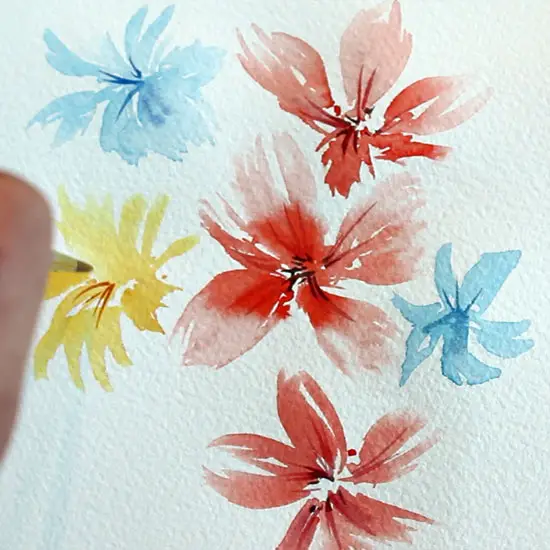
- Clean and dry your brush and paint more shape, and repeat the process with different colors.
- Before the shine completely goes off the paper, go around each flower and add a stronger color which could be a less dilute version of the same color, an adjacent or even complementary color.
- Finally, I wait until the paper is completely dry and with a small round detail brush I add some thin strokes radiating out from the center.
How To Paint Abstract Watercolor Flowers: Leaf Shapes
Colors Winsor & Newton Sap Green
Brushes: No.2 Dagger Brush
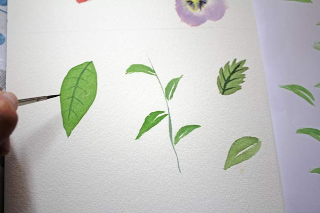
A dagger brush is a somewhat specialized brush and not every art shop stocks them at all. The tapering blade shaped tip is perfect for creating thin lines and also leaves, as you can see in the images below.
Place the tip of the brush on the paper and pull the brush towards yourself giving it a slight twist at the same time. This creates a stroke which tapers nicely at both ends. Repeat the stroke next to the first but make it slightly thinner leave a small gap to represent the central spine of the leaf.
Practice on some scrap paper , even thin printer paper will do and just practice he strokes over and over until you get the hang of it and can reproduce a pleasing leaf shape consistently.

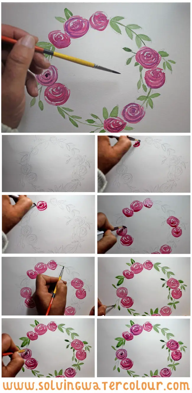
How To Paint Abstract Watercolor Flowers: Wreath Of Roses
Colors: Scarlet Lake, Sap Green and Dioxazine Purple.
Brushes: No.6 Round, No.2 Round.
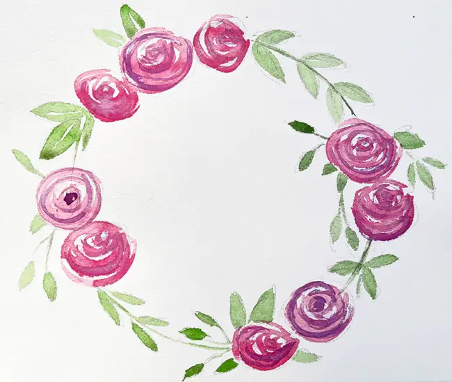
In the process of creating abstract art there is a distinction I tend to make between painting a thing and painting a symbol of a thing. When you paint a thing, you are calling on your powers of observation to recreate it’s inherent uniqueness. With this wreath is invented a symbol for a rose. Think of it as a kind of shorthand. You could call it cheating if you like, but there’s no right or wrong in abstract art and it’s supposed to fun after all!
Start with a circle ( I just placed a small plate and drew around it). Decide on the placement of your roses first then add the leaves and stems following the line of the circle you have drawn.
I find that I achieve the best results when I totally relax my wrist and hold the brush lightly at the tip of the handle, making small swirling motions, working my way outward from the center of each shape.
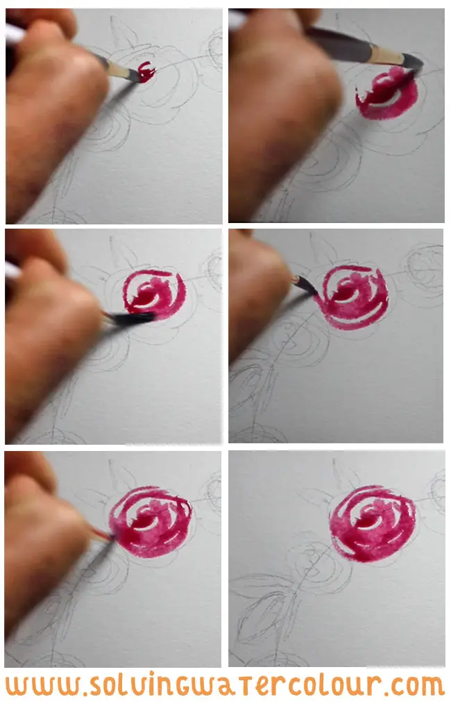
In the images below you can see that I’m simply repeating my rose symbol over and over. When the roses were dry, I added some stems and leaves. You can see that I”m holding the brush a lot closer to the ferrule this time, as I needed a bit more control and precision to follow the lines of my circle.
To finish the roses off, I needed to add a glaze of shadow over the top of them. To create the effect of a shadow you might be tempted to darken the red with black. The problem with adding black is that it sucks all the vibrancy out of your colors making them dull and lifeless, which is why I never use it, except for tonal studies. The solution to this problem is to shift the red to the darker adjacent color.
So What do I mean by that exactly? If you take a look at the color wheel , you will see that the colors adjacent to red are Red/Orange on the warm side and Red/Violet on the cool side. Shadows tend to contain more blue and Red/Violet is darker in tone so this is the way to go. The opposite is also true if I wanted to have a highlight I would have needed to go to the brighter warmer side of the color wheel.
Again, if you’re in any confusion about the color wheel concept and color theory and mixing in general make sure to have a look at my previous post on this.
To tilt my red towards Violet, I could have mixed in a little Ultramarine Blue but as I had it on hand, I just added a little Dioxazine Purple to the mix and went over my roses with similar loose swirls to the ones I’d already laid down.
Painting abstract flowers and floral designs gives you an excuse to play with strong bright colors. It’s a liberating and addictive combination and once you start you may find you don’t want to stop.




Thanks I am a mother and very busy! This helped me alot!
Thanks Abbey. I’m glad it helped.
Hi Andy,
At last, water color instructions that are easily read and understood, and I feel confident to try this now.
Regards Shanna
Thanks Shanna