
How Do You Mix Gray With Watercolor?
It’s not immediately obvious if you’re just starting out, how to mix watercolor grays. Up until now you may have just used a “Convenience’ gray. i.e. pre-mixed grays, assuming that was the only option. But grays can be mixed several ways. When you learn how to mix grays yourself, it opens up a whole range of possibilities for adding subtle tonal variation to your paintings.

The four most common approaches to mixing grays with watercolor are.
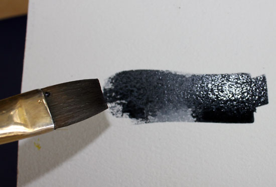
- Dilute black with water to lighten it to gray
- Take a “Convenience” gray, e.g. Payne’s Gray and modify it with another color.
- Mix the three primary colors red, yellow and blue together in different combinations.
- Mix complementary colors together.
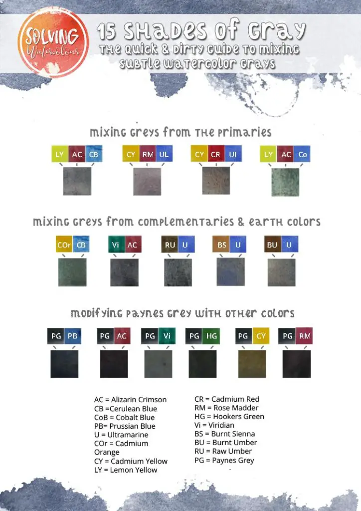
Convenience Grays
There are a number of convenience grays available from paint manufacturers, the most common ones are Paynes Gray, Davys Gray, Neutral Tint, Sepia. It’s also common to use diluted blacks such as Lamp Black and Ivory Black.
Payne’s Gray
Payne’s Grey is a shade of blue/grey that was named after the 19th Century watercolorist William Payne. Payne’s Grey tends to divide opinion amongst watercolor painters. Some use it extensively, while others avoid it completely. The chief complaint about Payne’s Grey is that it makes your paintings flat and dull. The fact is, there is no uniform version of Paynes Grey. Different paint manufacturers produce quite different versions of it.
For example, Daniel Smith make a traditional Payne’s Gray (Pigments PB 29, PBk 9) a Payne’s Blue/Gray (Pigments PB 60, PBk 6) While Winsor & Newton’s Professional series Payne’s Gray is a different combination of pigments ( PB15, PBk6, PV19).
I admit that I’ve always been a fan of Payne’s Gray and I was surprised to learn that it is so often disliked by watercolorists, but when I thought about it, I realized that I almost never use it by itself. I’ve always modified it with other colors.
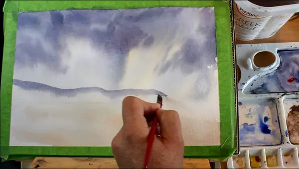
I particularly like to use it mixed with a little Ultramarine and Alizarin Crimson to create the bruise color of a stormy sky, such as in the seascape below. Click here for the full step by step tutorial for this painting.
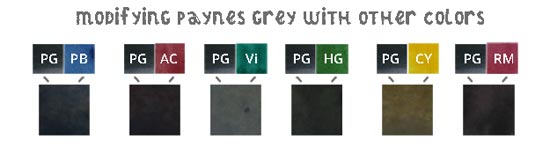
Besides Alizarin Crimson and Ultramarine, Other colors that work well with Payne’s Gray include Prussian Blue, which creates a cool slate gray that could potentially be used for the color of sea and rocks. Viridian Hue produced a surprisingly light neutral gray when you consider what a strong acidic color it is. I would use this gray potentially for rooftops, or muted skies. Hookers Green produced a dark gray/green that would work well in a landscape. Cadmium Yellow unsurprisingly produced the warmest gray. This color could be ideal for tree bark, or wooden barns. Rose Madder produced a warm violet gray that could make a stunning brooding storm cloud.
How To Mix Grey From The Primary Colors
Gray can be mixed by combining the three primary colors (Red, yellow and blue) together. It’s also possible to mix brown this way too, if there is too much red in the mix. So, in practice, you should lean the mix more to the cool blue side, as that will create a definite gray as opposed to a muddy brown.
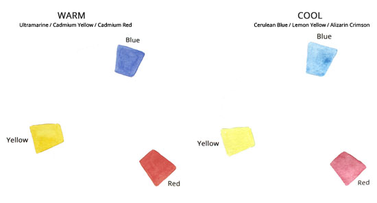
Not all primary colors are the same of course. There are many types of red, yellow and blue that you could potentially use but in the example below, I’m going to use a “Split primaries palette” of warm and cool primaries. Warm: Ultramarine, Cadmium Yellow and Cadmium Red. Cool: Cerulean Blue, Lemon Yellow and Alizarin Crimson.
You can learn more about color mixing and the difference between warm and cool colors in this post.
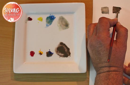
In the above pic you can see that I’ve mixed two grays. The lighter gray was mixed from the three cool primaries and the dark gray on the left was mixed from the three warm primaries.
You can also experiment by trying other shades of red yellow and blue, mixing warm colors with cool and varying the ratios. Create color swatches to see how many other kinds of gray you can come up with.

How To Mix Gray From Complementary Colors
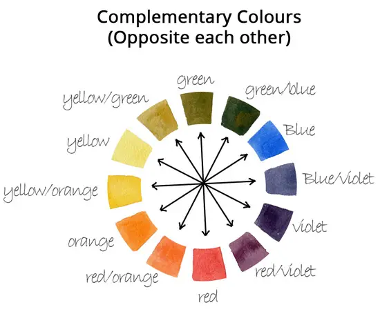
Using all three primaries is probably the most reliable way of mixing gray, however it’s difficult to get consistent color mixes when you are trying to balance a combination of three colors. You can also mix gray by combining and near complementary colors. Complementary colors are directly opposite each other on the color wheel.
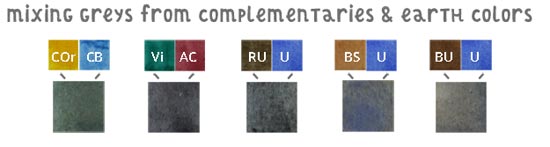
In theory this should work with any two complementary colors however, in practice, blues and greens mixed with their complementary and/or close complementary tend to work the best. For instance Cadmium Orange mixed with Cerulean Blue makes a lovely Teal gray and Ultramarine mixed with any of the earth colors (Which are very close to complementary) such as Raw Umber, Burnt Umber and Burnt Sienna make classic dark to mid grays. In fact Burnt Umber and Ultramarine is used by some manufacturer to make Payne’s Gray which I covered earlier.
How To Use Gray In Your Paintings
Example 1: Cold Wintery Beach
Materials List
Ultramarine Blue: Winsor & Newton | Daniel Smith
Indigo Blue: Winsor & Newton | Daniel Smith
Sap Green: Winsor & Newton | Daniel Smith
Burnt Umber : Winsor & Newton | Daniel Smith
Alizarin Crimson: Winsor & Newton | Daniel Smith
Paynes Gray: Winsor & Newton | Daniel Smith
Brushes
Winsor & Newton Series 150 Bamboo Round #6 Buy From Amazon
Rigger Brush (For thin tree branches etc) Buy from Amazon
Synthetic Squirrel Flat Brush Buy From Amazon
1″ Hake Brush Buy from Amazon
Princeton Synthetic Kolinsky Mop Brush Buy from Amazon
Paper
Arches Watercolor Paper Block, Cold Press, 9″ x 12″, 140 pound Buy from Amazon
Miscellaneous
Easy release painters masking tape Buy from Amazon
Pebeo Palette Knife Buy from Amazon
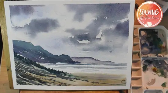
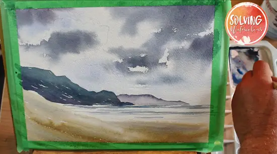
This beach scene has a chilly wintery feel and was painted used only one very modified convenience gray. Unlike the warm stormy gray clouds in the earlier example, I wanted a much colder slate gray sky which was achieved by mixing Indigo with Alizarin Crimson. I used this as a base gray and modified it with other colors to create some variation and stop it from becoming too monochromatic.
Total Time: 40 minutes
Step 1
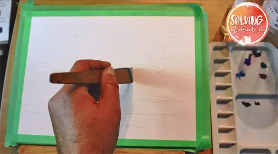
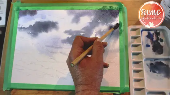
Begin by laying your painting flat or almost flat. Wet the sky with a 1/2 inch Hake brush. Leave some random dry areas where the dark clouds will go. You’ll see why in a second.
Step 2
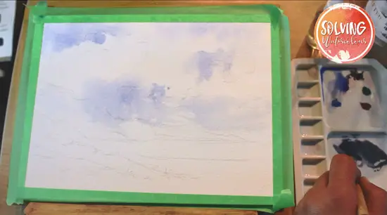
Mix up a pale wash of Ultramarine and paint in some patches of blue sky with a bamboo brush. As you paint up to and around the patches that you left dry, the wash will form hard edges in places and soft edges where the paper is still wet.
Step 3
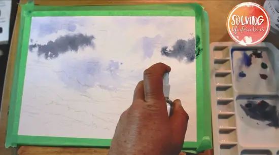
For the patches of dark cloud, pick up some of the Indigo/Alizarin Crimson gray on your brush and paint into the white areas between the patches of blue sky. Soften the edges with a spray mister. Because the painting is flat the paint will tend to slowly spread out rather than run down the paper in streaks.
Step 4
Continue to paint in the rest of the dark clouds. Strengthen the grays in selected areas by dropping in more of the gray mixture with your loaded bamboo brush.
Step 5
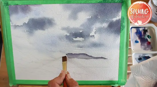
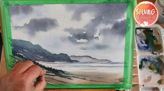
When the sky is complete, change the painting angle on your easel from flat to about 45 degrees, so that the paint will begin to flow downwards in a predictable way.
With a 1/4 inch flat brush, start painting the distant headland with pale wash of Payne’s Grey, Ultramarine and Alizarin Crimson. To create the effect of sea mist, paint the top of the land and blend out the color to a lighter tone by increasing the amount of water on the brush.
Step 6
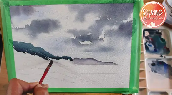
Add some Sap Green to the mix and with a No.4 mop brush start painting the nearer headland charge the wash with greens and blues to represent the grassy banks in a variegated wash of different colors with similar tonal values. Leaving a few small fleck of white here an there will add more interest and variation to your wash.
Step 7
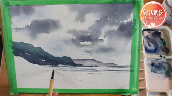
Now that the back ground and midground are complete, move into the foreground with the sea. The color of the sea is mostly just a reflection of the sky, the large amounts of weed and vegetation in the water also tend to give the sea a green color.
For the sea color then, let’s go back to the Indigo/Alizarin Crimson Gray and modify it with a little Sap Green.
The bamboo brush with it’s soft natural hairs creates a ragged feathered edge that is suggestive of lines of surf. It also helps to use a textured paper to enhance this effect.
Step 8
For the sand in the foreground, I’ve used a wash of Burnt Umber, muted with some Ultramarine.
Step 9
For the beach grass, I’ve used a stronger mix of gray/green and switched back to the mop brush. The mop brush is ideal for this, as it forms a sharp point but also holds a large amount of paint.
As a final step, every beach scene needs at least a couple of seagulls. A thin brush like a rigger is perfect for adding these.
Step 10
Scrape some highlights into the beach grass with a palette knife. As a final step, every beach scene needs at least a couple of seagulls. A thin brush like a rigger is perfect for adding these.

Excellent post! It helps to see all these mixing options for gray in one place. I have made grays in all of these ways, but it’s so easy to end up mixing grays in just a few ways out of habit. I’ve learned that mixing grays requires knowing the ratios needed for the specific paints you’re using, and that takes practice to get it right. I like your landscape, and I’ll give it a go. Thanks for this post!
Thanks Vivian
Looks simple but the color mixing is hard to follow
I will keep trying
Thank you
Hi Rose. Let me know how I can simplify it for you